| Image |
Comment |
| 08/19/2011 08:32:43 AM |
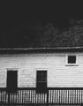
circa 1843by jmritzComment: Great processing here! I would like to see more in the photo. The view shown is a-typical for a picture of a home. Perhaps adding a person to the deck sweeping or something could help. I really like the tones and the contrast and the added grain. It is from another era for sure! |
 Photographer found comment helpful. Photographer found comment helpful. |
| 08/19/2011 08:29:18 AM |
Front Yard "Candelabra"by hahn23Comment: Awesome shot but not really a good subject for the challenge. Though I am sure this is a typical scene for you in your front yard, it doesn't say "Home" to me. |
| Photographer found comment helpful. |
| 08/19/2011 08:27:30 AM |
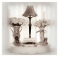
A home should be warm and invitingby NeatComment: I like the dreamy still life scene. I think your choice of processing is counter intuitive to the message you are trying to communicate. The high-key, soft focus processing along with the tones used leave me with a cold, icy feeling. I feel like I am looking at a memorial of some sort. |
| Photographer found comment helpful. |
| 08/19/2011 08:22:29 AM |
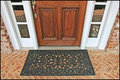
Always Waiting for Meby LydiaComment: This shot is simple and to the point. Nicely composed and good color and brightness. It works well for the challenge. |
| Photographer found comment helpful. |
| 08/19/2011 08:21:35 AM |
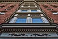
Up Top to the Rightby banmornComment: Very well framed. Awesome perspective and great detail in the lines of the brick. No noticeable jpg jaggies which are always trouble when it comes to re-sizing photos of brick walls. |
| Photographer found comment helpful. |
| 08/19/2011 08:19:42 AM |
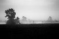
This place I call home, Eastern North Carolinaby bwoComment: You have captured a lovely pastoral scene. I like the contrast with the really dark darks and the soft white fog. I think that the foreground ought to be a hair brighter. The details seem to be lost. Also though the soft feel is good for the scene, I would like a touch more sharpness in the tree which appears to be the subject. You did very well with the B&W conversion and again the contrast is what makes this image. |
| Photographer found comment helpful. |
| 08/18/2011 03:37:06 PM |
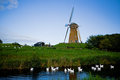
Timelessby amsterdammanComment: There is a lot of chromatic aberration around the edges of the horizon line. |
| Photographer found comment helpful. |
| 08/18/2011 03:34:26 PM |
|
| Photographer found comment helpful. |
| 08/18/2011 03:29:39 PM |
Clock of the tideby BrinComment: Another good take of a similar subject. I kind of like the brighter light on the other picture. But the muted colors here are cool. I do like the other photo using the rule of thirds better than this one which has filled more of the frame with the subject. Good job on the textures and I like the gradient sky! |
| Photographer found comment helpful. |
| 08/18/2011 03:25:55 PM |
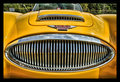
Timeless Classicby cryanComment: The window and the rest of the upper part of the picture is not really needed here. Otherwise awesomely sharp and very crisp chrome! Great color without being cartoony! |
| Photographer found comment helpful. |
Home -
Challenges -
Community -
League -
Photos -
Cameras -
Lenses -
Learn -
Help -
Terms of Use -
Privacy -
Top ^
DPChallenge, and website content and design, Copyright © 2001-2025 Challenging Technologies, LLC.
All digital photo copyrights belong to the photographers and may not be used without permission.
Current Server Time: 06/27/2025 07:40:27 PM EDT.