| Image |
Comment |
| 01/28/2003 01:05:25 PM |
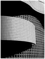
Wall of Windowsby NatashaComment: Great contrast and love the sinuous lines of the shot. It makes an excellent abstract. There are nits, and I don't know that you can do anything about them, but I'll point them out anyway. All of these beautiful clean lines are broken up by that wire (?) in the upper right corner -- go cut it down. ;-) There are also some strange shadows -- perhaps cast by the same wire, or by cousins orwho knows in the window section -- these are much less distracting than that wire. There are some ways, not too hard to use, to get rid of all of those problems if you'd like some help. |
 Photographer found comment helpful. Photographer found comment helpful. |
| 01/28/2003 12:55:41 PM |
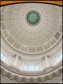
Window on Governmentby falveyComment: I'm trying to determine if the "yellow" along the very top of the shot disturbs me or not -- I guess if I have to question it, it does somewhat. I do like how it echoes the color of the stars at the top of the cuppola, but I think it might have been more effective to leave it off. Which, admittedly would have thrown off the rest of the composition unless you moved a little more to the center and got a bit more roof along the top of the shot. Otherwise, the right to left symmetry of the shot works well as does the verall exposure. |
| Photographer found comment helpful. |
| 01/22/2003 05:24:38 PM |
Milky Bathby JeanComment: Nice high-key shot -- excellent idea and composition. First, not a voter -- so you can take these comments for what you will. Have you considered completely desaturating this to B&W, then making your shadows just a tad darker (bringing your shadow level just to the point where the histogram barely shows any shadows), and your midtones just a bit lighter (that one's just a taste thing)? The level settings in PS that I was looking at were 32, 1.5, and 255. Just a suggestion based on my own personal taste. Now going to delete your image from my PS file. ;-) Good luck. |
| Photographer found comment helpful. |
| 01/22/2003 05:15:34 PM |
Got Milk?by arnitComment: Ripping off your own stuff, huh? Tsk, tsk, tsk. *grin* Nice spread on the milk and the color on the snow is a great complement to the color in the sky. Similar kinds of "nits" to my comment on the last one -- I just don't like where the lines in the background are cutting through your subject. The far mountains are a little too in line with his head and the open space behind him almost "cuts off his head." Silly little things. And since I'm not voting, take them for what they are -- comments of a deranged mind. |
| Photographer found comment helpful. |
| 01/22/2003 05:13:02 PM |
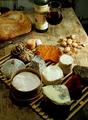
Then bring friends around it. by jjbeguinComment: This is a great shot. Pure and simple. Three things about it, however, bother me -- one is relatively stupid and can be ignored, another is probably just an overactive imagination (and is actually a compliment), and the third I'm not entirely certain what more you could have done to minimize. First, the cheese on the cheese board/tray look a little too symmetricaly laid out. Like I said, dumb, but there ya go. Second, something about the shot makes me feel like it was literally taken from a magazine. I think it has something to do with the colors. If it was, shame on you. If it wasn't, then congratulations and well done. *grin* Finally, the far background is a little distracting because my eyes are led around the picture and objects seem to keep leading me up to it. I start down with the cheeses, move up to the bread and knife, over to the wine and glass and then over to that empty spot of table and background. Then I start looking around back there to see what I can see. Perhaps a slightly more shallow depth of field to blur that out a bit -- coupled with perhaps a bit more light to darken it down a tad? At any rate, know that I'm not a voter, so you can take the comments for what they're worth. |
| Photographer found comment helpful. |
| 01/22/2003 05:03:45 PM |
Not a dropby DezComment: I dig the concept and the lighting. My "nit" is that the back of the glass is not as evenly "frosted" as the front appears to be -- lots of little nicks for one, and then just not as smoothly "frosted" either -- almost as if it's got fingerprints or something that were then frosted over. I'm not explaing myself well. Still one of my more favorite shots... |
| Photographer found comment helpful. |
| 01/22/2003 05:01:13 PM |
Just blackby vjozComment: Makes me think of a stock photography shot -- which is not a bad thing. Nice sense of motion by shooting at the angle you used. Wondering how hammered you'r getting for not using any actual dairy in the shot but just alluding to it. Works for me, but then I'm not a voter so.... |
| Photographer found comment helpful. |
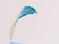
| 01/22/2003 04:59:11 PM |
Yoghourtby lionelmComment: Totally a personal preference: I think I would have tried to get the background a more pure white. I like the form and simplicity and sense of action in the shot. I have to admit, I can't figure out exactly what it is, but that's not stopping me from likiing it. |
| Photographer found comment helpful. |
| 01/22/2003 04:55:30 PM |
Caught Snackingby AnachroniteComment: Funny idea, well composed, but I'm not certain that the dramatic lighting helps you out here. I think that the vibrant colors of the cheese in contrast to the darker/starker mouse would have been contrast enough. I think I would have liked to see it evenly lighted to the same level as the upper left corner -- with perhaps some shadow contributed by the mouse itself. |
| Photographer found comment helpful. |
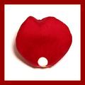
| 01/22/2003 04:49:18 PM |
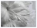
Leche de Rosaby bamasterComment: Nice clean whites, the border is a good addition that helps support the red of the petal. It looks like there is some good detail in the petal, but I wish the photo was larger so I could see some more of that detail. |
| Photographer found comment helpful. |
Home -
Challenges -
Community -
League -
Photos -
Cameras -
Lenses -
Learn -
Help -
Terms of Use -
Privacy -
Top ^
DPChallenge, and website content and design, Copyright © 2001-2025 Challenging Technologies, LLC.
All digital photo copyrights belong to the photographers and may not be used without permission.
Current Server Time: 08/17/2025 05:52:42 AM EDT.