| Image |
Comment |
| 10/11/2003 04:58:24 AM |
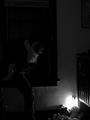
A Mother's Worst Nightmareby ShannonComment: I can really identify with this idea. Composition is good, but the whole image needs a tiny bit of more light to balance it off. The hot spot around the nightlight draws your eyes away from the main subject. |
 Photographer found comment helpful. Photographer found comment helpful. |
| 10/11/2003 04:52:05 AM |
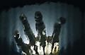
What I see when I'm drowningby JC_HomolaComment: This is very interesting shot. I cannot figure out how you did it and it intriques me. It looks very artistic. I love the texture of the water and the contrast between the light and the darks. |
| Photographer found comment helpful. |
| 10/11/2003 04:44:49 AM |
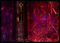
Doorway in the Dreamingby kostiaComment: Nicely setup. It makes me want to come into your image and open that door :-)) The composition works well, as the small hallway leads you to the door. The colours are really dream-like. I don't like the black border as there is almost no black in the image itself so it overpowers it a bit. |
| Photographer found comment helpful. |
| 10/11/2003 04:42:16 AM |
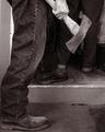
Murderous Intentby sherComment: Scary. You have probably added noise to this image on purpose, so I woun't comment on that. Composition is not bad as my eyes go from the front foot to the axe directly. If you wanted to portray fear, dirty dark feeling of despair, you have succeeded. It reminds me of some scene from X-Files :-))) |
| Photographer found comment helpful. |
| 10/11/2003 04:34:35 AM |
Do You Die in Black and White?by ImagineerComment: This is funny. Love the b&w treatment of it as well as the title. I don't usually die in my dreams, but some of them ARE b&w. Do you in your dream see more detail in the dark parts of the shot? Also are your lighter dream parts as grainy? Just a suggestion. Good fun shot. |
| Photographer found comment helpful. |
| 10/11/2003 04:31:43 AM |
Movie Houseby ArtifactsComment: I would like to know the idea behind this shot, as it doens't immediately portrais dream or nightmare. But if you explain it to me I might score you higher. |
| Photographer found comment helpful. |
| 10/11/2003 04:28:19 AM |
Building His Dream Carby dsa157Comment: Great triangular composition. I am not too keen on the colour desaturation as it only works if one part of the photo has colour and the rest is without. Also the border is very overpowering your otherwise great image. Making it thinner would have helped a lot. |
| Photographer found comment helpful. |
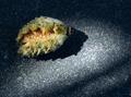
| 10/11/2003 04:25:03 AM |
Fertility Dreamby grigrigirlComment: Something tells me you know quite a bit about dream translation. This photo is great in every way. Sharpness is superb, composition is very nice, the idea behind this shot is amazingly artistic, and I really like the lighting of this shot. The colours of the sead pod nicely contrast with the greyness of the ground. Sorry I cannot tell you what's wrong with this, as I would not change a thing. Very well done. |
| Photographer found comment helpful. |
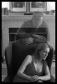
| 10/11/2003 04:22:04 AM |
When ever I want You.... by Firstrich1Comment: This reminds me of the scene from the movie Sixth Sense. Good use of b&w. The elements on the right and left of the chair are a bit distracting - removing them could have made it cleaner. I am aslo not too keen on the thick black border. It is the darkest part of your photo and takes a bit from the over all dreamy feel of the image. |
| Photographer found comment helpful. |
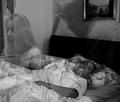
| 10/11/2003 04:19:39 AM |
A Restless Mind by nbortonComment: Interesting photo. Good triangle composition. Like that it is b&w. The only thing distracting is the tie hanging over the left ghost image. Pretty good shot. |
| Photographer found comment helpful. |
Home -
Challenges -
Community -
League -
Photos -
Cameras -
Lenses -
Learn -
Help -
Terms of Use -
Privacy -
Top ^
DPChallenge, and website content and design, Copyright © 2001-2025 Challenging Technologies, LLC.
All digital photo copyrights belong to the photographers and may not be used without permission.
Current Server Time: 06/18/2025 02:40:08 PM EDT.