| Image |
Comment |
| 08/28/2005 03:47:06 AM |
Surfacingby oOWonderBreadOoComment: The water seems to be distorting the model's figure in odd ways. I like the refraction patterns of the water, but I'd prefer a shot with less of a funhouse-mirror effect on the model.
This shot reminds me of jmoore's Venus from the Fantasy World challenge, but that may just be because I haven't seen many pictures of nude women underwater with their faces obscured. |
 Photographer found comment helpful. Photographer found comment helpful. |
| 08/28/2005 03:29:50 AM |
Back in blackby FyzarlComment: I think that the composition would be better if the model exhibited better posture. |
| Photographer found comment helpful. |
| 08/28/2005 03:28:10 AM |
Releaseby GeocideComment: The light on the model's node and fingertips seems a bit too hot. The missing fingertips on her left hand are distracting. I like the pose, but the visual impact would be stronger if her position was more symmetrical; the angle of her right foot is the only major thing throwing off the balance. Nicely shot; this is one of my highest rated images of the challenge so far. |
| Photographer found comment helpful. |
| 08/28/2005 03:15:10 AM |
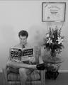
Your Wife's Lawyer Will See You Now Mr. Smithby GolferDDSComment: I love the lawyer's name. The scene is a little busy, but I suppose that it may have been necessary to convey the desired waiting room atmosphere. The sticks in the bouquet which occlude the diploma are distracting. |
| Photographer found comment helpful. |
| 08/28/2005 03:00:08 AM |
Divine Meditationby SCI 009Comment: The composition is well balanced, but the lighting doesn't create adequate separation between your model's head and the tree in the background. Omitting the ferns (or moving them to the foreground, behind the model) and moving the camera so that the model occupies the bottom 2/3rds of right corner and the tree fills the top 2/3rds of the left corner would preserve the balance and eliminate the appearance of having a tree growing from her head. Nice use of B&W to highlight the textures. |
| Photographer found comment helpful. |
| 08/28/2005 02:52:06 AM |
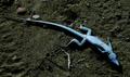
Skin Flickedby vtruanComment: Your model has rather scaly looking skin; you might suggest that they apply lotion a few hours before they arrive for the shoot. Removing the stick that's close to your model's foot would have improved the shot. The head-down, diagonal placement within the frame adds an element of visual tension which, while effective, seems in need of a subtle complement (e.g. a diagonal element crossing underneath the head) to underscore the tension. |
| Photographer found comment helpful. |
| 08/28/2005 02:35:45 AM |
Bauhausby whiteroomComment: There's obviously a story being portrayed here, but I feel like I'm missing a large part of it. I can't identify the two bright white spots on the wall above the nude figure, and as such I'm unsure whether they're distractors or clues about the scene. |
| Photographer found comment helpful. |
| 08/28/2005 02:30:49 AM |
~~~ Eve~~~by JutildaComment: This image seems a touch too minimalistic. A more effective shot for your title might have been to see the apple with a bite taken out of it being clutched to her chest. |
| Photographer found comment helpful. |
| 08/28/2005 02:28:09 AM |
veiledby les0910Comment: I love the pose: the crouched position and the framing both add interesting visual tension which contrasts nicely with the vulnerability of the nudity. The B&W do a nice job of bringing out the tonal range of the image, but I'd be interested in seeing a warm duo tone version. The fact that the model's hands are balled into fists seems a touch odd (based on her position, I'd expect to see her face resting in her palms with her fingers curled slightly around her forehead); since the scene appears to be so well orchestrated I'm inclined to believe that I'm missing the significance of this aspect of the pose. This is easily my favorite entry in the challenge so far. |
| Photographer found comment helpful. |
| 08/28/2005 02:18:00 AM |
Glorious Momentby ApeeComment: Without the context afforded by the challenge I'd dismiss this as a bad photo; I maintain that the composition could stand some improvement, but aside from the hot spots on the hand I can't identify anything in particular at the moment. Nice job of letting the viewer fill in the missing details. |
| Photographer found comment helpful. |
Home -
Challenges -
Community -
League -
Photos -
Cameras -
Lenses -
Learn -
Help -
Terms of Use -
Privacy -
Top ^
DPChallenge, and website content and design, Copyright © 2001-2025 Challenging Technologies, LLC.
All digital photo copyrights belong to the photographers and may not be used without permission.
Current Server Time: 08/20/2025 04:33:48 AM EDT.