| Image |
Comment |
| 10/08/2005 10:15:40 PM |
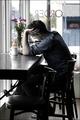
Portrait of an Unknown Writerby ElemmennopeComment: I think that a shallower DoF would have served you well here, helping to both freeze the motion of the author as well as blurring the shop across the street. Aside from the flowers and the red neon sign, the colors here are fairly unsaturated. While selective desaturation can serve as a powerful compositional aid, I can't see any reason for it here. If it was intentional, having some clue in your title would help to bring it out. If not, reducing the saturation on at least the red/magenta channels would help to make the image look more uniform. See [url=//www.dpchallenge.com/tutorial.php?TUTORIAL_ID=25]this[/url tutorial for info on how to selectively desaturate under Basic Editing rules. |
 Photographer found comment helpful. Photographer found comment helpful. |
| 10/08/2005 10:09:43 PM |
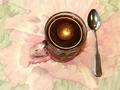
Waiter,I asked for LIGHTENER,not BRIGHTENER !!by elderellComment: Although the cup is positioned well against the tablecloth, I find the overall effect distracting. Perhaps having the scene lit only by the light reflected in the coffee and the rest painted with light would have created a more striking image.
|
| Photographer found comment helpful. |
| 10/08/2005 10:07:05 PM |
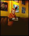
Colorful Caféby gsalComment: This would be a stronger photo if the woman was in focus rather than the image on the wall. |
| Photographer found comment helpful. |
| 09/04/2005 06:45:44 PM |
Diffraction and Lightby DrAchooComment: I'm interested in learning how you did this. The effect is nice, but this looks more like a proof-of-concept study than a final image. |
| Photographer found comment helpful. |
| 09/04/2005 02:19:24 PM |
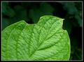
Dew and Leafby justin_hewlettComment: The bite marks in the leaf detract from the image. This is a nice shot of a leaf, but they're so common that such photographs need to be done exceptionally well to be interesting. |
| Photographer found comment helpful. |
| 09/04/2005 02:13:17 PM |
|
| Photographer found comment helpful. |
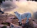
| 09/04/2005 02:11:49 PM |
Dusk & Labradorby hideoutComment: This has been sharpened so much that several of the elements look like they've been pasted in from other pictures. |
| Photographer found comment helpful. |
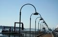
| 09/03/2005 11:36:22 PM |
Dock & Lampsby pinbokeshattaComment: I like the leading lines of the lamps. This image would be stronger if there was something at the end of the trail of lamps. I find the uneven horizon distracting. |
| Photographer found comment helpful. |
| 09/03/2005 11:34:05 PM |
|
| Photographer found comment helpful. |
| 09/03/2005 11:31:31 PM |
Dreadlocks & Lollipopsby dsa157Comment: Somehow the desaturation makes those look less like lollipops. I think that this would have been better in color. |
| Photographer found comment helpful. |
Home -
Challenges -
Community -
League -
Photos -
Cameras -
Lenses -
Learn -
Help -
Terms of Use -
Privacy -
Top ^
DPChallenge, and website content and design, Copyright © 2001-2025 Challenging Technologies, LLC.
All digital photo copyrights belong to the photographers and may not be used without permission.
Current Server Time: 08/19/2025 07:14:06 PM EDT.