| Image |
Comment |
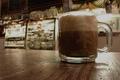
| 10/09/2005 03:18:46 AM |
de-sat not de-cafby tenfrozentoesComment: The DoF is okay, but I suspect that the woodgrain in front of the cup wasn't the intended subject. Moving the point of optical focus to the intended subject would improve this image. |
 Photographer found comment helpful. Photographer found comment helpful. |
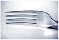
| 10/09/2005 03:14:19 AM |
Forkby SimonkasprzakComment: I imagine that dirty forks are present in coffee shops, but this still seems too uninteresting and off topic to capture my interest. |
| Photographer found comment helpful. |
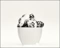
| 10/09/2005 12:30:51 AM |
Berries and Creamby joezlComment: Without the title I'd have never figured out what this was. Without the cup, it would have been difficult to even judge the scale of what I'm looking at. I find the odd off-white color cast somewhat distracting. This might have been a lot more interesting if you'd have pushed the saturation much higher than it was originally rather than rendering this in B&W. |
| Photographer found comment helpful. |
| 10/09/2005 12:27:41 AM |
A Day in the Life by TuckersmomComment: The freckles on the arm of the woman on the bottom left seem to contain the constellation Scorpio. I find this far more meaningful than any horoscope that I've ever read. I can't see anything wrong with this image, but there's also nothing about it that suggests that it wasn't taken by someone's grandmother with a point and shoot camera. |
| Photographer found comment helpful. |
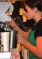
| 10/09/2005 12:20:55 AM |
Coffee Barristaby Sherri1209Comment: I'd like this a lot better if the barrista's eyes weren't covered by her hair. The overexposed metal in the bottom left and the milk jug along the bottom edge are somewhat distracting. |
| Photographer found comment helpful. |
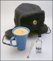
| 10/09/2005 12:06:54 AM |
Winter Warmerby WarbyComment: I'd like this better if it looked more like it was taken in a coffee shop than in a studio. |
| Photographer found comment helpful. |
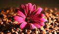
| 10/09/2005 12:05:50 AM |
Coffeeby saevarjoComment: I would like this a lot better if the image were larger and didn't look oversharpened. I appreciate your novel approach to the challenge; a flower who's petals contrasted more with the color of the beans (yellow, for example) might have had more of an impact. |
| Photographer found comment helpful. |
| 10/09/2005 12:03:12 AM |
|
| Photographer found comment helpful. |
| 10/08/2005 11:59:33 PM |
Postcards to Peruse at While Waiting for Your Javaby chefsamComment: This would feel more like your art than a picture of someone else's if there was a more human touch to it. A hand, a shadow, a reflection, or a touch of handwriting on the back of a postcard would have made this much more interesting. |
| Photographer found comment helpful. |
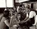
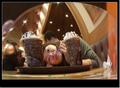
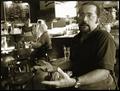
| 10/08/2005 11:55:09 PM |
The Regularby tpocComment: Harsher, less diffused light on the man's face and sharper focus would give this photo a big kick. |
| Photographer found comment helpful. |
Home -
Challenges -
Community -
League -
Photos -
Cameras -
Lenses -
Learn -
Help -
Terms of Use -
Privacy -
Top ^
DPChallenge, and website content and design, Copyright © 2001-2025 Challenging Technologies, LLC.
All digital photo copyrights belong to the photographers and may not be used without permission.
Current Server Time: 12/15/2025 12:04:48 AM EST.