| Image |
Comment |
| 03/21/2009 12:56:10 PM |
gas lampby tiby_dicuComment: I think you did a great job on the lamp itself, but the niche/window/shelf that it is on takes away from it. It's so dark behind it, but the wall is so white it's distracting. I think you could have cropped a lot of the extra window out, changed the angle slightly, and it would make a huge difference in making the lamp 'pop'. |
 Photographer found comment helpful. Photographer found comment helpful. |
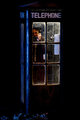
| 03/21/2009 12:53:03 PM |
Public telephone boothby mitalapoComment: Great job. I love the touches like the hat pushed back and the papers blown against the booth - it gives a kind of forlorn look to it - stranded in the rain or something along those lines. |
| Photographer found comment helpful. |
| 03/21/2009 12:51:14 PM |
|
| Photographer found comment helpful. |
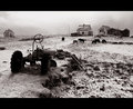
| 03/21/2009 12:47:47 PM |
Good Ole Cubby gsalComment: I'm guessing that the tractor is the focus of the photo. In that case, my suggestion would be to change up the angle on it, or crop in tighter - the rest of the landscape are distracting from it. I can see why it would be your subject. It's really cool. |
| Photographer found comment helpful. |
| 03/21/2009 12:45:21 PM |
|
| Photographer found comment helpful. |
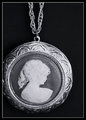
| 03/21/2009 12:44:30 PM |
''Nan's Old Cameo"by CraftyComment: This is really simple and pretty. However, the lighting is washing out the portrait, and reflecting too much on the metal which exaggerates the soft focus. The detail on it is beautiful - I don't think it needs a soft focus. |
| Photographer found comment helpful. |
| 03/21/2009 12:39:19 PM |
1940s News Sourceby BalkoComment: I love this photo. There's a lot to look at, but I couldn't name one thing that's distracting. The only thing I would change is the lighting. It looks as though it was taken with natural light during the day. Unfortunately, I think it's just a bit too bright. Still a great photo! |
| Photographer found comment helpful. |
| 03/21/2009 12:34:58 PM |
|
| Photographer found comment helpful. |
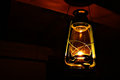
| 03/21/2009 12:33:51 PM |
Old Oil Lampby drewhosickComment: It seems a little flat. The lamp is really cool, but it just doesn't pop. Still - the composition is good, and I like the angle and crop. |
| Photographer found comment helpful. |
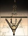
| 03/21/2009 12:26:28 PM |
Human Aided Designby LaMasComment: I love the simplicity of this, but my eye is being drawn a bit to the heavy shadows. Still a great photo - nice interpretation and composition. |
| Photographer found comment helpful. |
Home -
Challenges -
Community -
League -
Photos -
Cameras -
Lenses -
Learn -
Help -
Terms of Use -
Privacy -
Top ^
DPChallenge, and website content and design, Copyright © 2001-2025 Challenging Technologies, LLC.
All digital photo copyrights belong to the photographers and may not be used without permission.
Current Server Time: 08/18/2025 11:40:12 AM EDT.