| Image |
Comment |
| 04/23/2012 10:58:47 AM |
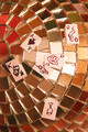
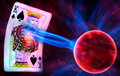
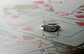
bad shuffleby posthumousComment: To be completely honest, I'm not at all sure what this is about or even what the point is. Image seems overly grainy with over driven color. That maybe the effect of the tiles, but the color spots are distracting and the cards don't make any sense to me. |
 Photographer found comment helpful. Photographer found comment helpful. |
| 04/23/2012 10:56:12 AM |
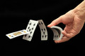
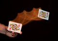
Last Man Standingby GeneralEComment: I'm probably being overly critical here, but the uneven lighting and the soft focus at the top of the card distracts from the intent - those trouble spots are where the eye is directed to (looking at the image as a whole). Another angle might have helped with a little more emphasis on even distance lighting and focus. Just my opinion you understand. |
| Photographer found comment helpful. |
| 04/23/2012 10:54:01 AM |
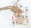
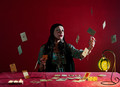
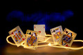
Gold Jackpotby davisambroseComment: Image looks washed out to me - no real definition to the subject matter - as I understand the subject to be. The jewelry looks sharp in one area and not to sharp in another. A little different angle in taking the image would have improved it - maybe a more top down look? |
| Photographer found comment helpful. |
| 04/23/2012 10:52:02 AM |
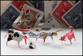
Successive Cardsby thesaint77shComment: Were the two spades and two clubs intentional? I like the image - plain, simple which is different. Nothing to really complain about from a technical standpoint. Nice job. |
| Photographer found comment helpful. |
| 04/23/2012 10:50:52 AM |
Cosmic-Kingby RobskiComment: I assume you are referring to Laevar Bolto - one of Superman's super villains? If not, so what - cool image. Worth a ten just for the skill behind developing the image. Well done. |
| Photographer found comment helpful. |
| 04/23/2012 10:48:01 AM |
|
| Photographer found comment helpful. |
| 04/23/2012 10:00:47 AM |
I... Fold.by LydiaComment: Another clever and creative composition. There is some competition in this challenge that's for sure. I like this as a top ten finisher. Well done. |
| Photographer found comment helpful. |
| 04/23/2012 09:57:48 AM |
Discordia Regisby craigdmComment: Not to be pedantic, but its Regius - regis is not a latin word. More properly, it should be Discordia Regina or Regius - depending on what you want to convey.
Just sayin'. :>)
Great image - must have taken a few tries to get it right like the previous image. Great idea and composition. Well done. |
| Photographer found comment helpful. |
| 04/23/2012 09:50:20 AM |
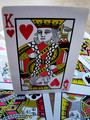
Fit for a Kingby briandsdComment: Like to know how many takes this one took to get it right. Great idea and good execution of that idea - very creative. Well done. |
| Photographer found comment helpful. |
| 04/23/2012 09:49:00 AM |
|
| Photographer found comment helpful. |
Home -
Challenges -
Community -
League -
Photos -
Cameras -
Lenses -
Learn -
Help -
Terms of Use -
Privacy -
Top ^
DPChallenge, and website content and design, Copyright © 2001-2025 Challenging Technologies, LLC.
All digital photo copyrights belong to the photographers and may not be used without permission.
Current Server Time: 12/21/2025 04:34:41 PM EST.