| Image |
Comment |
| 03/09/2009 08:35:24 AM |
Kept in the Family since 1873by HeiSchComment: This is quite an interesting shot from the perspective of the subject, but let down slightly by the composition. I don't think the all black background helps here, I think an old desk or perhaps stone would have worked much better given the subject, as it is the blackness actually draws my attention to the edges because of the strong contrast.
Also, I don't like the way part of this is out the frame, it's such an interesting subject it would have been good to have it fully in the shot. |
 Photographer found comment helpful. Photographer found comment helpful. |
| 03/09/2009 08:31:11 AM |
A return to 1876by quiet_observationComment: This is a nice scene but I think you've tried to fit too much in here. I'm guessing the structure is the main subject, and only because of the theme of the challenge. Otherwise I would tend to look towards the path leading out of the right of the frame. The trees seem to cut a diagonal line right across the shot, but don't actually lead anywhere, and the structure is more of an incidental than a subject. |
| Photographer found comment helpful. |
| 03/09/2009 08:28:23 AM |
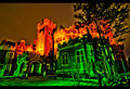
Toronto's Urban Castle by leugim_sevenComment: I can see the effect you are going for here, but it looks way over processed to the point where it appears you have superimposed one shot on top of the other. I also don't think the colours work well for the idea (which I assume is haunted / mystery), perhaps if the background building was toned down a little and the foreground building more grey it would work. |
| Photographer found comment helpful. |
| 03/09/2009 08:26:30 AM |
One Pennyby suemackComment: The shot is clear and in good focus and the subject is quite obviously the subject, but very much in the way you would document something, rather than make a good photo if you see what I mean. There is nothing particularly outstanding about this shot and I have no real reaction to it. |
| Photographer found comment helpful. |
| 03/04/2009 06:46:35 AM |
tonemapped.jpgby lifeafter2amComment: You've processed this very well and managed to avoid that horrid HDR look that puts me off all HDR shots in general! Great job. |
| Photographer found comment helpful. |
| 03/04/2009 06:44:44 AM |
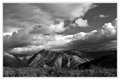
February Landscape-Eagle Peakby twmaxComment: I agree with you on the B&W here, it makes the sky look really dramatic and brings out the texture in the rock.
I agree with one of the comments below about the size of the mountains, I'm not sure why but they could be any size at all, including 5ft high rocks! It could be because the foreground seems to lead up to them very quickly making them feel a lot closer than they are (and thus smaller).
I'm guessing from where you are you're looking over the edge of a cliff or hill and there's an expanse of valley between you and the mountains, but the infinite DOF is causing the sense of scale to be lost.
Perhaps if you were a bit further forward so we could see what is between you and the mountains it would give a better sense of scale. |
| Photographer found comment helpful. |
| 03/04/2009 06:38:23 AM |
2_Februaryby DJWoodwardComment: This is very nice, I like all the elements in it but I think you might have oversharpened it a little. You can see it in the waves where the sun is reflecting off them and it was actually the first thing that caught my eye (and thus became all I could focus on in that annoying way that happens).
Great landscape shot though, can very much visualise it hanging on a wall. |
| Photographer found comment helpful. |
| 03/04/2009 06:30:33 AM |
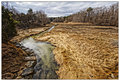
Strandedby StructorComment: That is a wonderful expansive sky. It makes the thumbnail look like a large landscape image then when you open it you get a pleasant surprise and find it's actually a fairly close shot with lots of detail! |
| Photographer found comment helpful. |
| 03/04/2009 06:26:55 AM |
Winter Thawby Bear_MusicComment: This is really strange, I'm looking at this pic and all the elements in it are nice, the sky, the water, the wavy effect in the grass, composition and exposure are good, yet I feel there's something wrong with it or something missing. I can't quite put my finger on what it is. I keep looking at it and coming back to typing in the hope that I'll get it.
Perhaps it's the colours, they're not flat by any means, but they are a little samey. Could also be the sky, seems a little overprocessed compared to the rest. Sorry I can't be more descriptive, that's just how I feel about this shot :/ |
| Photographer found comment helpful. |
| 03/02/2009 07:48:03 AM |
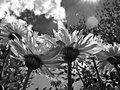
Summer Flowersby quicheComment: Love the perspective you've used here to make the flowers look so tall. Great detail and contrast as well. |
| Photographer found comment helpful. |
Home -
Challenges -
Community -
League -
Photos -
Cameras -
Lenses -
Learn -
Help -
Terms of Use -
Privacy -
Top ^
DPChallenge, and website content and design, Copyright © 2001-2025 Challenging Technologies, LLC.
All digital photo copyrights belong to the photographers and may not be used without permission.
Current Server Time: 08/06/2025 02:13:47 AM EDT.