| Author | Thread |
|
|
01/29/2012 10:25:33 PM |
Greetings from the Critique Club!
First impression: Yowza, I am very glad I don't owe you any money!! I'm afraid to say anything other than 'nice portrait', but then you asked for a critique...so here goes...
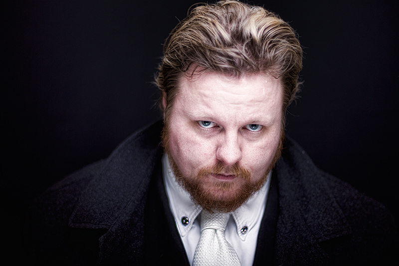
Aristic: This kind of pose is a great one, all glowery and mean. I love the neat white shirt and tie, I almost wonder how long it'll be before they're splattered with blood or something! As you have fair hair (love the red beard and blond hair) there seems to be a little bit of washiness going on. Burning to bring out your eyebrows would have made a difference. That or carefully applied makeup just a titch darker than your own hair, so it wouldn't look fake.
Technical: Crop is a little tight to the top of the head, and I am wallowing a little in the negative space flanking you. I feel that a crop in to the outside edge of the coat lapels would have pulled it together a little more and tiny bit more headroom would just give it that little bit extra. Comp and lighting are fine for this shot. Try putting the light (a flood?) lower than your face, say angled up at you approx 45% and get that great monster-lighting effect. That combined with the glower could make all the difference.
Overall: A good finish so no complaints there, but never hurts to mess around and try out some of the suggestions here. You can never shoot too much. Keep up the great work!
Feel free to PM me,
Susan |
|
 Photographer found comment helpful. Photographer found comment helpful. |
|
|
01/29/2012 10:22:29 PM |
sorry added to critique above
Message edited by author 2012-01-30 09:42:31. |
|
| Photographer found comment helpful. |
Comments Made During the Challenge  |
|
|
01/22/2012 10:00:45 PM |
|
Very nice portrait. Well done! |
|
| Photographer found comment helpful. |
|
|
01/22/2012 09:39:19 PM |
|
Very nice work with the light. Nice work with the glaring look, too. |
|
| Photographer found comment helpful. |
|
|
01/16/2012 09:42:36 PM |
|
I like the look here. the details matter, and you have captured them. |
|
| Photographer found comment helpful. |
|
|
01/16/2012 04:57:44 PM |
|
| Photographer found comment helpful. |
|
|
01/16/2012 01:17:06 AM |
|
When I opened this Photo I felt like I owed you money... :D good Photo |
|
| Photographer found comment helpful. |
Home -
Challenges -
Community -
League -
Photos -
Cameras -
Lenses -
Learn -
Help -
Terms of Use -
Privacy -
Top ^
DPChallenge, and website content and design, Copyright © 2001-2026 Challenging Technologies, LLC.
All digital photo copyrights belong to the photographers and may not be used without permission.
Current Server Time: 06/28/2026 09:43:59 PM EDT.