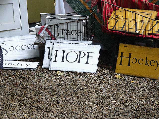
Should have out *more* of the signs in the pic and less of the gravel. Would have made it a bit more dynamic. Good shot, though. One of the few I have actually liked in this challenge.
I like the harry potter font sign. I don't feel that it is really provocative. I would have liked to see the sign, almost burried, as if it were being discovered. I've been to a ton of little stores in California and Oregon that had hidden treasures. The one common thing, however was that the good things always hid. They were there, but only if you looked. That's what I want to feel in this picture. It's there, but I want more.







 Add photograph to your favorites
 Add photographer to your favorites


 Photographer found comment helpful.


