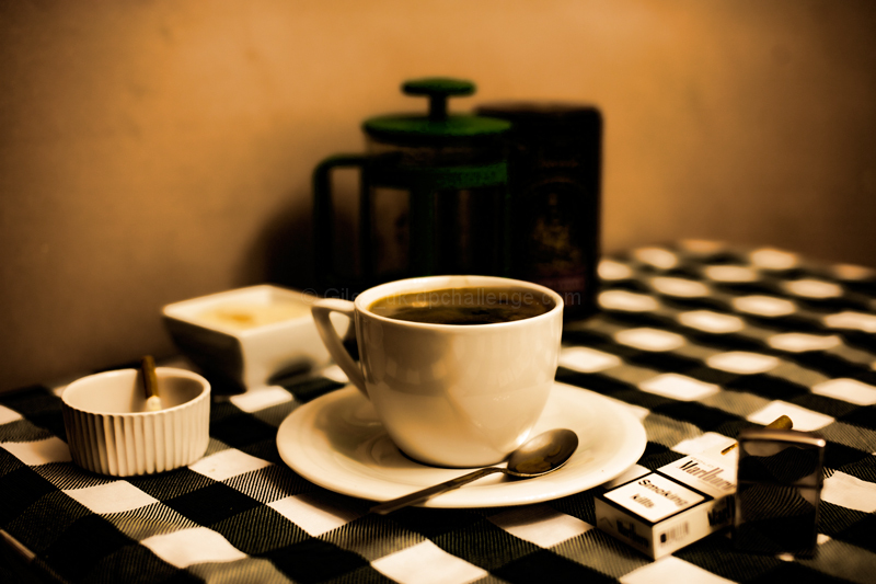
I'm another of your 5's... like Jon_H below, I use that for an average shot that doesn't grab me. I don't actually mind the sepia but the splash of green on the coffee pot distracts from that feel so I would have desaturated all colours before adding a sepia tone to it.
I felt that none of the objects were actually in sharp focus which was a little off-putting - the area with most clarity is the table cloth to the bottom left of the saucer which just felt like the wong place.
Finally I feel the composition is a little cluttered with the dish and pot behind the cup. It may have been better if they were spread a little more so that each had their own space - the depth of field you chose was good and with a bit of separation between the items would have helped focus the viewer on the main subjects. Central composition doesn't always work but in this case the cup and saucer would have been fine in the centre providing the other items were more balanced.
I note you expected a 5.5 but got a 5.9 which isn't too bad. Hope that helps!
I was one of your 5's for me I thought the sepia colouring was too much and overpowered the shot. The composition was not balanced and everything seems to be up near the camera leaving the back of the shot empty. The vignette also looks blotchy.
5 is my average vote which I use for those that don't capture my interest.
I'm highlighting the negatives in my opinion as per your request in the forum.
Hope this helps.
At full shred there's a famous French black and white film called coffee and cigarettes this is where the shot comes from the black and white and the check pattern etc :) pleased with this in my top 5 :)
I'm wondering if you listen to Angus & Julia Stone, they have a song with that title. Nice photo. My only nitpick is the brightening of the highlights makes the white checkers in the blurred region stand out a bit much, so they compete with the coffee cup for attention. Other than that, good job.






 Add photograph to your favorites
 Add photographer to your favorites


 Photographer found comment helpful.


