| Author | Thread |
Comments Made During the Challenge  |
|
|
08/31/2004 09:47:07 PM |
|
Poor cintrast. poor composition. |
|
|
|
08/30/2004 09:30:39 PM |
|
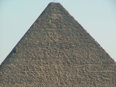
Nice pyramid. I just don't see "hope" without using the title. By the way, what is that on top of the pyramid - a warning light for night time flyers? |
|
 Photographer found comment helpful. Photographer found comment helpful. |
|
|
08/30/2004 05:17:24 PM |
|
hope...hmmm...not seeing it.... |
|
| Photographer found comment helpful. |
|
|
08/30/2004 12:21:51 PM |
|
Maybe it suits the subject but for my opinion it´s quite overexposed. If you have some proper photoediting program then use it to look at the histogram. I would also have liked to have the image bigger. |
|
| Photographer found comment helpful. |
|
|
08/29/2004 08:31:09 AM |
|
Very small photo. Check through the forum for tips on saving for web. I can't see how the pyrimid displays hope! Sorry |
|
| Photographer found comment helpful. |
|
|
08/28/2004 06:55:17 PM |
|
Over exposed and too bright. Too small also. The composition is too plain. it's a straight on shot of an object. It's a family vacation photo album shot. |
|
| Photographer found comment helpful. |
|
|
08/28/2004 06:21:17 PM |
|
|
|
08/25/2004 03:11:00 PM |
Sorry, don't feel hope here.
I have been to Egypt and seen the pyramids. I think you could stick to the subject and make the theme work. I would suggest backing up so you see more of the pyramid and put it in some kind of context. I would consider possibly shooting it from an oblique angle and to try to get it at sunrise or sunset so you get more dramatic shadowing. Jodie Coston has a free online photography course (//morguefile.com/ver3/classroom.php) which would give you some tips on composition and lighting. Keep at it, and good luck. |
|
| Photographer found comment helpful. |
|
|
08/25/2004 01:58:02 PM |
|
A little too small to really see the quality of the photograph. Also the pyramid is not quite centered. |
|
|
|
08/25/2004 03:28:56 AM |
|
I don't like the cropping (you cut the top) and it needs a lot of work on levels and contrast too |
|
| Photographer found comment helpful. |
|
|
08/25/2004 02:19:13 AM |
i fail to see the point of this picture in relation to the theme.
Also, a simple "auto-level" in Photoshop would've help greatly with the colours and sharpness. |
|
| Photographer found comment helpful. |
Home -
Challenges -
Community -
League -
Photos -
Cameras -
Lenses -
Learn -
Help -
Terms of Use -
Privacy -
Top ^
DPChallenge, and website content and design, Copyright © 2001-2026 Challenging Technologies, LLC.
All digital photo copyrights belong to the photographers and may not be used without permission.
Current Server Time: 06/29/2026 06:58:13 AM EDT.