| Author | Thread |
|
|
12/14/2004 05:45:17 AM |
|
It's a real shame a work of refined art of this calibre goes unrecognized by the DPC voting community. A score of 5.125 is simply offensive. I think people are voting on this site as if it's a game of Halo. The lines are subtle yet suggestive and originally composed. It effuses a delicate lover's after morning glow which unfortunately got trampled by a mindless voting mob. |
|
|
|
10/21/2004 10:01:40 PM |
59/88? this is a tasteful and elegant shot. probably why it didn't score too high here.
for the record - i think it's beautiful.
|
|
|
|
10/21/2004 03:24:56 PM |
|
This has got to be one of my favorite shots of yours. And the title is perfect. Great job. I am jealous... Anyhow. Just added to the favorites. |
|
|
|
10/11/2004 09:05:53 PM |
|
I voted this low but i really don't know what the hell I was thinking. The composition is flawless; the line looks hand-drawn and transcends the literal spect of the piece. The fact that this did not win is a shame to be blamed on the likes of me. Most of my other favorites are a goof. I will buy a print of this as big as it can be. Oh yeah, and for the record-this is so good that if this is 59 out of 88- who needs to be number one? |
|
|
|
08/30/2004 10:13:28 AM |
|
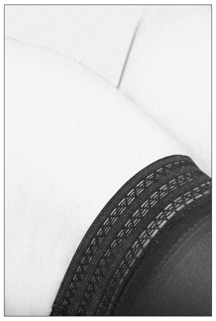
I added the grain after the shot. I agree that fishnet stockings would have been better, but I didn't have any at my disposal for this shoot. It was sort of an afterthough after looking at this photo. I may try that next time around. |
|
|
|
08/30/2004 05:29:28 AM |
I have been seeing shapes in a number of things lately; grain on the ceiling, in wood, tree branches and of course clouds and such. It has made start looking at things from a minimalist's perspective -- just how much detail is needed to get the idea across? -- that sort of thing.
Then I see this image, and it is nearly a perfect example of just that. There are a couple of things I wonder about though. I know you mentioned you tried it with and without stocking, but did you perhaps try it with stockings with less of a solid feel to them -- closer to fishnet, but not quite there. The black is just a bit over-whelming. The second thing I didn't care for is more of a personal matter -- I don't care for grain -- but beyond that, I feel it detracted from the minimalistic feel of the image.
But, we each have our own ideas of how we like things.
David |
|
Comments Made During the Challenge  |
|
|
08/29/2004 11:55:20 PM |
|
A lovely B&W. the simple lines and the crop make this art. |
|
|
|
08/27/2004 12:26:47 PM |
|
I really love the contrast and simplicity in this shot. Very nice job. |
|
|
|
08/27/2004 02:33:08 AM |
nice idea and great title I like the mimalistic effect (I hope I spelt that correctly)
Its certainly different |
|
|
|
08/26/2004 06:29:54 PM |
|
Very nice, simple, smooth, clean, and leaves something for my imagination. Solid entry. The only thing I think that could have made this great is a little bit of shadows between her legs...imo |
|
|
|
08/26/2004 04:08:24 PM |
|
nice minimalistic approach. Good use of contrast. |
|
|
|
08/26/2004 02:09:30 PM |
|
Simple lines, almost abstract. Nice use of white space contrasting against almost solid black space with intricate detail. Maybe would have cropped 1/2 inch off bottom to get rid of one small jagged edge on stocking. Really nice photo. |
|
|
|
08/25/2004 12:15:26 PM |
|
|
|
08/24/2004 04:27:11 PM |
|
Nice composition - I like the triangle created by the creases as her legs meet her torso. The inclusion of a segment of the thick black stocking gives the image an anchor. I'm wondering whether I'd prefer the use of a model with pubes to provide some dark details at the top to balance with that dense block of black but I'm not sure - perhaps it's the simplicity that works best - there is so little detail in the flesh that it almost makes it seem like a statue, not real at all. Nice job. |
|
|
|
08/24/2004 11:57:39 AM |
|
Stunning high key image. love the grain and composition. |
|
|
|
08/24/2004 08:46:57 AM |
|
Well thought out, very artsy photo. Maybe a little bit over exposed. Nicely done. |
|
|
|
08/24/2004 07:42:11 AM |
I see your idea, but feel perhaps it's a bit too light to be pulled off right. Sexy stocking and pose but really not enough detail and too much exposure to work in my opinion.
Nice use of grain though.
|
|
|
|
08/24/2004 06:25:26 AM |
|
good idea but a bit too white and looses detail because of that. |
|
|
|
08/24/2004 02:45:07 AM |
|
Interesting shot but the skin is so blown out it loses interest. |
|
|
|
08/23/2004 11:06:48 PM |
|
This is wonderful. Minimalist and yet interesting and super suggestive. I think others may not like the fact that there is so light dark color on the screen. But I like it. |
|
|
|
08/23/2004 11:01:54 PM |
|
Can't tell if this is a picture or a sketch. |
|
|
|
08/23/2004 10:38:10 AM |
|
ghastly title - such an old cliche - and the stocking is not even alluring either |
|
|
|
08/23/2004 10:12:38 AM |
|
It may be partly my monitor - but it is really difficult to make much out of the top half. |
|
|
|
08/23/2004 07:33:44 AM |
|
Good title, strong compositon. |
|
|
|
08/23/2004 06:24:46 AM |
|
Interesting take, and it works. |
|
Home -
Challenges -
Community -
League -
Photos -
Cameras -
Lenses -
Learn -
Help -
Terms of Use -
Privacy -
Top ^
DPChallenge, and website content and design, Copyright © 2001-2026 Challenging Technologies, LLC.
All digital photo copyrights belong to the photographers and may not be used without permission.
Current Server Time: 06/27/2026 05:43:38 PM EDT.