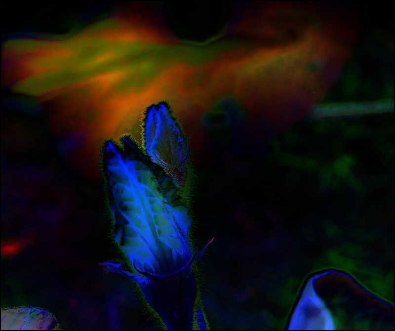
I expect to receive a very low score because 90% of the abstract-ness of this squash blossom is in the color created in PP. But...
There is an abstract quality to squash vines & all their details that is very attractive to the designer mind. I used PP to enhance & illustrate the abstract qualities rather than the realistic, documentary ones. Topaz DeNoise, CS4 sharpen, auto adjust tone, contrast, & color. A layer of SEP2 BW, blended in Difference mode (& flattened) was blended back into the stack in Pin Light mode. I turned the BW layer off & then added a top layer of Curves adjustment, blended in Overlay mode. Flattened, cropped, & saved for the web.
Statistics
Place: 129 out of 182 Avg (all users): 5.2521 Avg (commenters): 8.3333 Avg (participants): 5.2911 Avg (non-participants): 5.1750 Views since voting: 573 Views during voting: 198 Votes: 119 Comments: 6 Favorites: 0





 Add photograph to your favorites
 Add photographer to your favorites

 Photographer found comment helpful.


