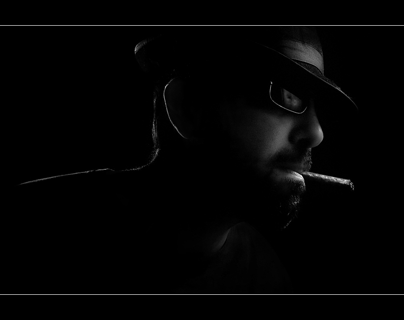
Pretty good- I like the lighting outline on the shoulder and ear. I don't care for the border being in the picture, though. Also, I might have preferred a setting or hint of background rather than the blank background for a greater "film noir" feel, but that is minor- you made the lack of background work pretty well here.
I havent been through all the entries yet but this one caught my eye straight away. Yes it could be argued that this isnt Film Noir-ish enough but:
Composition - Couldnt ask for better. I dont mind that he (you I guess) is looking out of the frame rather than into it. All major elements are on a thirds line or close enough.
Technique - you certainly know how to use and control lighting. There is just enough light to accentuate the key areas and give shape to objects. The hair / shoulder light at the back is a nice touch as is the focused light on the cigar / bottom lip. (Is that a skull in the reflection of the glasses? :-) Protagonist's death?! - see it does fit the challenge well!)
PP - I love this look and you have controlled it very well. My only nit would be to use an off white line in the letter box border - the white is a bit too bright compared to the rest of the image... perhaps the same tone as the tip of his nose? Just a thought.
Overall - maybe not what the viewers consider a film noiresque shot but a fine shot none the less!
This is one of my favorites. I really like the pose, lighting and processing. (My only nit pick is the sunglasses seem too current, it is a little distracting.) Still an awesome shot.





 Add photograph to your favorites
 Add photographer to your favorites

 Photographer found comment helpful.


