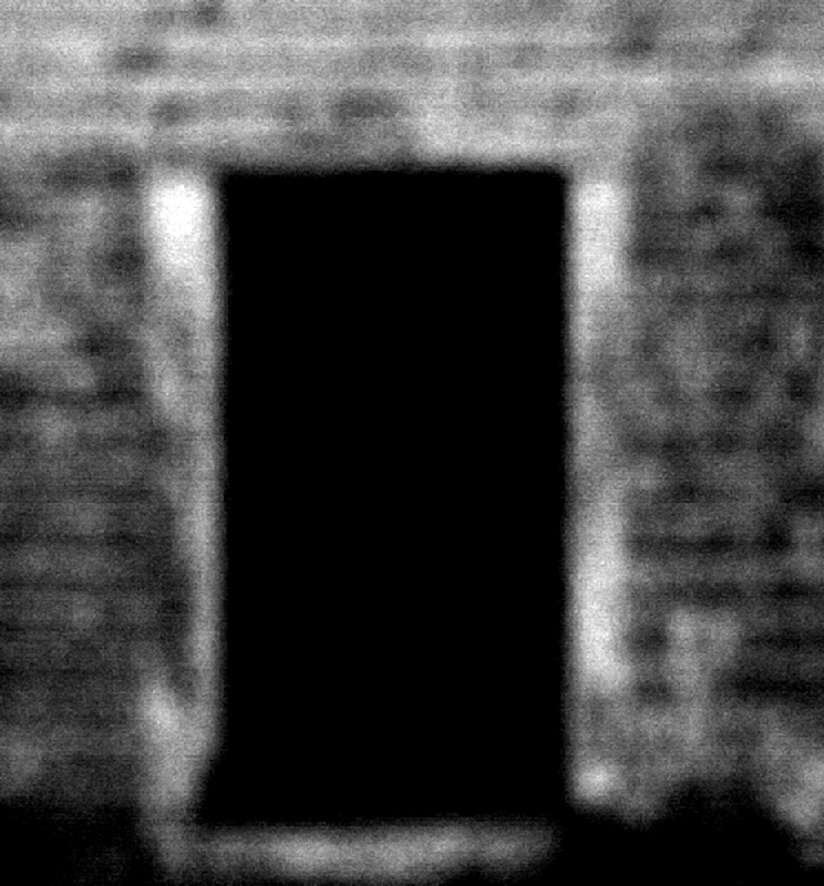
It's interesting how the image seems so in your face in comparison to other photos in the voting sequence. Your title seems almost commanding me to enter while the image seems just as demanding of attention.
It's moments like this I wish you could change the grey to suit the photo; a black background would be so much more effective here. The use of negative space as the principal subject is striking to begin with, but the blackness of it begins to dominate too much and lessens the overall impact. Not being quite zoomed in might have improved composition a bit; and maybe rotated 90 degrees CCW? I like the style, though the level of noise is a bit counter productive. Is the blur in camera? A bit of softness would have corresponded with my sensibilities a bit more, but then that's an entirely subjective comment.
My First Weighted Scoring System ™; composition + technical 1/3, challenge 1/1, post processing results 1/2, ooooh factor 1.5/3, originality 0.50/1 = 5





 Add photograph to your favorites
 Add photographer to your favorites

 Photographer found comment helpful.


