Greetings from the Critique Club, David :-)
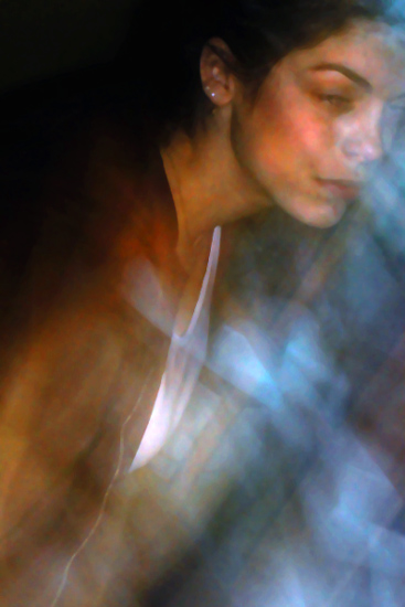
Composition: Something different! :-) I really like the angle you used, but I'm not sure about the cropping. I don't think it's too tight, but there could be a bit more space on top and to the right. You cut right throught the girls eye, which doesn't look good in my opinion.
Lighting/Colours: The lighting is good and I also like the colours. Some parts seem to have a bit too much contrast and saturation e.g. the cheek and the neck of the girl. This makes her look a bit unhealthy ;-)
Focus: The blur is the most striking part of the photo. Some people don't like that, but I do. What I especially like here is that while the photo has a lot of motion blur, the girl's face is clear and somewhat in focus. The motion blur around her looks like some mystical veil. This really makes this photo in my opinion.
Digital Processing: You used only 80kB for your jpeg file but you can use up to 150kB when uploading to DPC. In order to increase the quality of the jpeg image try using bigger file sizes. The smaller the file, the more jpeg compression artifacts you get. They're not so striking here because of the overall blurry look but I think some parts e.g. the girls cheek would look a bit better.
Art: Your photo is very moody. The blur and the angle you used add to the myserious and somewhat distorted look. The title fits perfectly. I like this all, but so much blur usually doesn't do well here on DPC. But this doesn't have to stop you ;-)
I looked to see what other photos you make and I really like your style. I hope you'll keep participating on a regular basis.
Stephan |






 Add photograph to your favorites
 Add photographer to your favorites

 Photographer found comment helpful.


