Hello from the Critique Club! You asked for an indepth critique of your image and here it is:
First, I'm glad bohemka left you a long commend, since you got one of the monosyllabic idiot comments from "puzzle". Seriously.
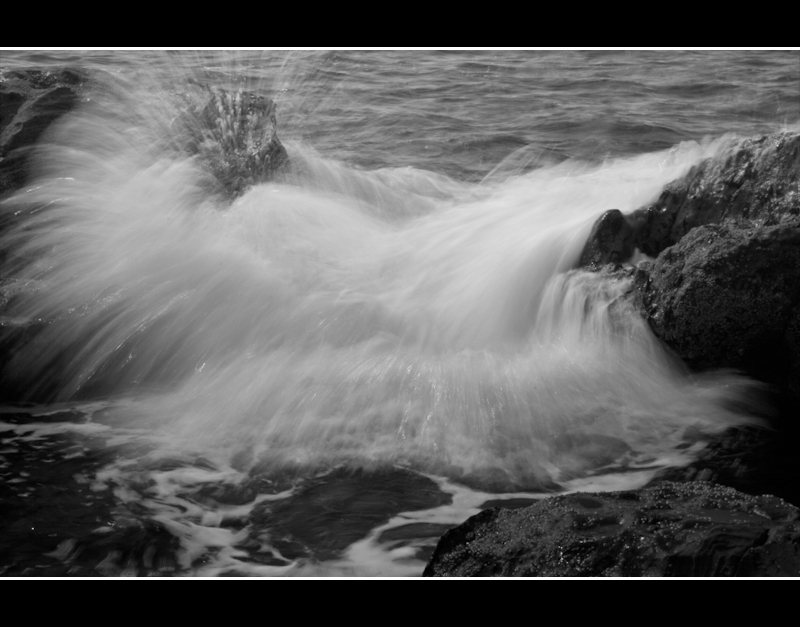
But back to your photo. I actually liked it and gave it a 6. It's sort of quirky with that water spray. They eye wanders up to the left top corner where the action is. Therefore, it's a little unconventional. And DPC doesn't usually appreciate unpredictability in photography. One of the reasons you got a 5, I'm sure.
That aside, you captured the motion of the water very well. The frame of the black rocks is good, as well. The frame you added sort of pulls everything together, though I'm not usually a fan of fat frames.
The black and white tones are a bit flat - lack of contrast. And compositionally, there's no flow (ha). I feel a wider shot might have helped, so that the eye has somewhere to go.
Keep shooting! I'll be interested to see what you come up with in the future.
Very nice movement. I'm not voting, but I'll critique this anyway because I like photos like this where I actually might have a decent suggestion. Emphasis on might.
As powerful and impressive as the motion of the wave is, I'll contradict myself now and say the photo to me is too busy. And I think that is because it's a tight crop and the border does not suit the crop. I might have pulled back off this crop a little to get a greater sense of perspective of the scene, or had the water rushing in from out of frame more (compositional preferences only), but my main issue is that I feel the thick, white lines overpower the white of the wave, and also contradict the lines in the wave, which are running near vertical. I think if you were to ditch those white lines (or at a minimum reduce them to a pixel wide each and soften the white (maybe pulling the white from the wave with the eyedrop tool)) this would be a much stronger and less confusing image.
I typically don't give a damn about borders, but this seems like a really quick way to improve this photo.
Keep in mind I'm not a good photographer, but as a viewer, that's what I see.