...from Critique Club...
Hi Bob
FIRST IMPRESSION:
Oh, my eyes!! :)
COMPOSITION:
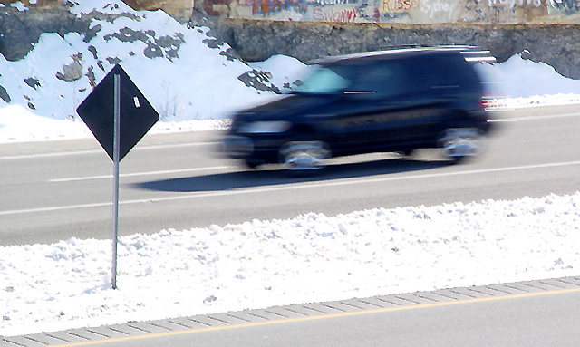
I like how you set up the angle on this shot. I don't think that having the vehicle on the top half of the frame does any justice to the photo. I understand that you needed to crop out the power lines...i'm curious as to how bad they really were. I like the sign being in the frame...it almost interacts with the driver and with whatever is happening to the car. :|
TECHNICAL:
Exposure is fair on this shot, and focus is very nice (handheld, hey? Not bad) The snow does seem a bit overexposed (minor). Nice DOF to show the sharpness of the foreground and background contrasting with the blur of the car. f2.4?? really? :|
ARTISTIC:
Nice idea, although I think you lost good votes because it's not very original. I think alot of people already expected alot of moving cars and you suffered cause of that. :|
OVERALL:
I nice enough shot, that, IMO, could have been composed a bit better.
SIDE NOTE:
I think you entered your ISO and Shutter speed reversed when you submitted the photo. You have it ISO=1/50 and Shutter=100.
Best of luck in the future. Don't hesitate to PM me if you have any questions about this critique.
Cheers...zadore. |




 Add photograph to your favorites
 Add photographer to your favorites


 Photographer found comment helpful.


