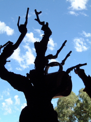
Not enough contrast between the mug and the tree. Not sure if it was possible but I think doing your light meter on the tree or mug would have led to a more balanced exposure.
I think I see what you were going for, but maybe if you got the mug out on a branch silhouetted against the sky by itself, you could tell what it is better, and would have more impact. Also, changing the angle could get rid of the green tree in the corner. Just the vine and mug and sky I think would be much stronger.
I first viewed this image on my monitor at work which isnt a good one so I waited to get home to check it out before I put my vote in on this one. It's just too dark. Perhaps if you had moved to an area where your lighting was more on your subject, it might have worked.
Well, on my second go round, I finally noticed the purse (I think). Nice exposure on the sky, but the foreground is too dark. I can barely make out the subject. The sky comes off as the central focal point of the image.
i get the idea, but the execution gets killed by the lighting (or lack of), and the composition isn't helped by the tree in the lower right. maybe move the mug up a branch, get an angle that lets us make out the mug better, and crop to lose the tree?





 Add photograph to your favorites
 Add photographer to your favorites


