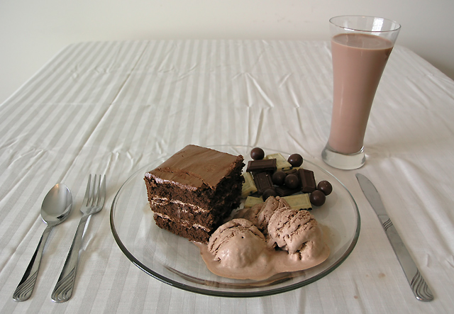
I think less would have been better here. The standing glass and the flat plate somehow breaks the balance here, the glass is also tilting to the right. I would have captured a smaller part of the plate, rather cut from the plate, it would have been more effective. The background is untidy, and lighting could be improved, too. Use diffused lights from more directions, and at least you could have ironed the table-cover before the shot. Keep trying, the stuff on the plate looks good. :-) (3)
Looking good! The tablecloth is a bit distracting because of the wrinkles (hey, we all have wrinkly table cloths) This picture would have probably looked a bit better on a white surface & white background, but it's a good photo anyway. 8.
This image comes across as quite ominous. It could be called "Death by Chocolate" or "How To Have A Stroke" lol. Its quite an ironic image in that it looks like any normal setting yet the food is not so normal. It creates quite an interesting feeling.
What a great idea, only problem is the folds in the table cloth take away from the image, as to the little spots by the knife. I really like the angle and the DOF, plus the white balance seems right on.
Good photo but there are quite a few distractions. I think first a more overhead approach would have been better so that you don't see the end of the table and the wall in the background. Ironing the tablecloth and avoiding stains would also help for a more polished appearance. If you put the darkest chocolate closes to the light it would avoid being lost in the shadow of the cake.





 Add photograph to your favorites
 Add photographer to your favorites


 Photographer found comment helpful.


