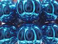
Your photograph transforms a very ordinary part of modern life to a very striking image. The centre of interest –the parking meter—is clearly focussed and this contrasts well with your selected background, the yellow car. The juxtaposition of these two colours and objects is what your composition is about and you convey this powerfully. I particularly like the reflections on the meter and the reflections on the windscreen—both these root your photo firmly in the city with the buildings on the windscreen—this is a very urban image and a very urban blight. Your title sums up the picture, the primary colours ( including the red ) and the urban blues of an expired meter
I like the way you have cropped this image—enough detail of the scene is left in for the viewer to grasp what the photo is about. I see no problem digital artefacts-the image is smooth and clear where it is needed.
To sum up—a very clever use of colour—contrasts and objects, reflections and a very witty title manage to transform the mundane into a good photograph. To me the only criticism I could make about this well thought out photo is the very thing that attracts me to it—it is a very ordinary subject that no one is going to get excited about—and it is a tribute to your skill that you scored this highly!
I love the blue on the yellow like this. very nice capture. I really like the angle and framing/cropping you have chosen. Definately blue. Great focus and clarity. a wonderful shot overall! Good luck in the challenge.
Really like this, would like to have seen a tighter crop and less car windsheild. Maybe from another angle to get more of the yellow car behind it. Slick in any case- 8
i would have submitted the other one. but hopefully you get higher for this one. the colors are interesting, not quite compliments, which works well. the curves work well together. the straight lines work well too. it doesn't scream "blue!" like so many other entries this time. i might have desaturated the red of the parking meter sticker though. it's not bright enough to make this a primary colors picture, and as is is just a little distracting. anyhow. overall, it's still a very well composed picture, and definitally worth an 8. - arach.
Both the color blue, and the feeling blue. It's was a good idea, though to me the picture feels a little boring. maybe a different crop of it would have turned out better.







 Add photograph to your favorites
 Add photographer to your favorites

 Photographer found comment helpful.


