Greeting from the Critique club!
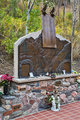
Now, first impressions of this image, i'm not sure if i like it or not, im moving towards liking it, i see what your trying to do, leaving a busy background to show the statue in the environment, and making sure people know he is a public figure.
Technical aspects,
the lighting, is a ittle too harsh, but as your outside it's hard not to have, and the bright areas, are too blown out, and atrract way to much attention. I would have also liked to see the face of the statue more lit up, maybe this could of been done in post processing, using levels.
I think the blue/yellow tones are good, but give it an odd feeling, and also looks as if you have used topaz or something similar.
Composition of the image, i would rate 4/10 the image is too centred and in my opinion, if the building in the background where level it would look more pleasing (even though it would give your figues a tilt, which some people like) one good thing is the wall/line the model and the stature is on, it draws your eye from one side of the image to the other, making sure you dont miss any details
The "feeling"
the pose of the man, and statue together show that he was a good figure amoungst his population and he had supporters.
the mood it gives is slightly less appealing, the processing is gloomy and strange.
Overall, i think the low scoring was down to processing and composition, altough personally i like the tones and hdr/topaz etc type look, others obviously didnt. |