| Author | Thread |
|
|
12/11/2002 03:23:18 PM |
CRITIQUE CLUB!
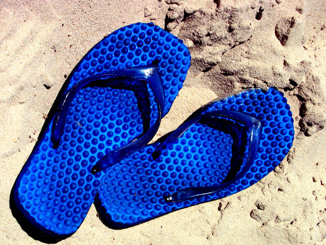
This is an excellent photo and perfect for the challenge. The subject is great, focus is sharp, and the framing is very appealing. I enjoy how the subject fills the frame.
I have only two comments. One, the photo is overexposed a bit. The glare on the straps is distracting, and you lose a lot of detail in the sand. Granted, on a beach in the middle of the summer sun there's not a whole lot of control you've got. The other comment is the color saturation. While I know the challenge was "Blue," it seems like maybe you bumped up the blues in this photo a bit too much? It's soooo vibrant that it almost looks faked.
Overall, an excellent entry. I truly enjoyed this image.
Rob 8) |
|
Comments Made During the Challenge  |
|
|
12/08/2002 11:52:10 PM |
|
I like this quite a bit. However I don't think you needed to saturate the blue as much as you did. It is clean and simple and the straight overhead angle works very well with this shot. |
|
|
|
12/08/2002 09:10:36 PM |
|
*grrr* I envy you for the warm weather ;-) It's a very nice photo. I like the contrast of the colours and the texture of the sand. I seems a bit overexpsured because in the lower left corner the sand is very bright. |
|
|
|
12/08/2002 05:59:36 PM |
|
This is definitely different, I must say. Very clear and bright and sharp focus. What BLUE flip flops. Doesn't seem like Christmas though. I'll take mine, thank you. Good photo. Not a "wow" but a good solid technically right one. PTL 7 |
|
|
|
12/08/2002 09:29:42 AM |
|
|
|
12/08/2002 08:21:29 AM |
|
For me - at christmas time it would be a prescription for frostbite!! - Inspzil Nice pic btw |
|
|
|
12/04/2002 02:01:00 AM |
|
Can't see what it has to do with Christmas (except for the hot weather bit) but it's a great shot! |
|
|
|
12/03/2002 11:41:00 PM |
|
This is wonderful! An excellent choice of blue. You'll do well, I'm sure. |
|
|
|
12/03/2002 08:37:00 AM |
|
Definately blue. Focus and lighting are great. Really meets the challenge. 8 tomlw |
|
|
|
12/03/2002 03:38:00 AM |
|
i like the color but maybe another angle showing more of the beach or even some of the water might make this photo look better. |
|
|
|
12/02/2002 07:52:00 PM |
|
Good composition, blues are great. |
|
|
|
12/02/2002 06:58:00 PM |
|
This is a very eye catching shot. I loved it as I skimmed the thumbnails also. Nice shot....stunning! It would make a good travel poster. Bravo!!!! Justine. |
|
|
|
12/02/2002 04:24:00 PM |
|
I like the contrasts here... the shoes could have been a little clearer, look slightly blurry, and the sand looks burnt out in a few places. Nice idea though... and very striking blue! Lucky you... much warmer then where I am . Good luck! |
|
|
|
12/02/2002 09:46:00 AM |
|
Very emotive. Interesting use and great idea. Shoes seem blurry, maybe illusion but still a great shot and a great idea. |
|
|
|
12/02/2002 02:20:00 AM |
|
I like how bright the blue is in this one. Normally I wouldn't but in this shot it works well. Nice picture. |
|
|
|
12/02/2002 02:05:00 AM |
not sure how the title fits... but great use of contrasting colors...
~anachronite |
|
Home -
Challenges -
Community -
League -
Photos -
Cameras -
Lenses -
Learn -
Help -
Terms of Use -
Privacy -
Top ^
DPChallenge, and website content and design, Copyright © 2001-2026 Challenging Technologies, LLC.
All digital photo copyrights belong to the photographers and may not be used without permission.
Current Server Time: 06/27/2026 10:31:00 PM EDT.