| Author | Thread |
|
|
10/04/2010 10:51:42 AM |
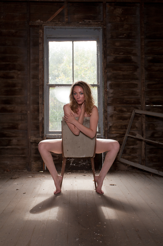
Hi, you asked for a critique, so here it is. Obviously the whole thing is completely subjective so I just hope you find a couple of useful nuggets in here!
Overall, my take is that I like your concept; putting the classic 'Scandal' pose into a decaying building is interesting and effective.
Technically: Your DOF and focus is spot on. For me, the background is as important as the subject, so keeping it all in works really well. If it was feasible to judge it so that the view outside of the window was OOF, that would be gravy but probably quite tricky! I think that you made the right choice on the lighting, using fill flash, but a gel or tinted reflector might have been fairer to the model, as the current flash (for me) highlights the white of the inside of her leg.
Artistically: It is interesting that you have her offset on the window, but centred in the shot, rather than setting her a little off centre, I think that this does work to add to the 'portrait' feel. Certainly not cropping too close gives a great sense of the environment which you were keen to shoot. The model's pose is great, tense at the bottom, relaxed at the top to keep one guessing - but her face looks apprehensive rather than inviting, and I am not sure this fits with the rest of the picture.
In summary, it is very nice to see a different take on the challenge, and it was very well realised, scoring deservedly well as a result. |
|
 Photographer found comment helpful. Photographer found comment helpful. |
Comments Made During the Challenge  |
|
|
09/28/2010 06:58:12 PM |
|
simple, elegant and procative. Nice choice of environment and great lighting. |
|
| Photographer found comment helpful. |
|
|
09/28/2010 03:18:41 AM |
|
beautiful work, though I hope to see more contrast for the model to shine. |
|
| Photographer found comment helpful. |
|
|
09/27/2010 12:36:21 AM |
|
Great pose, shadow and tone. I wish the model was at the center of the window. |
|
| Photographer found comment helpful. |
|
|
09/26/2010 09:58:45 PM |
|
Careful of Splinters! Love the tone and composition. :) |
|
| Photographer found comment helpful. |
|
|
09/24/2010 05:34:05 PM |
|
Like the lighting. Like how the outside light cast the shadow on the floor. Sensual and gritty at the same time. Interesting image. |
|
| Photographer found comment helpful. |
|
|
09/22/2010 04:47:23 PM |
I'm standing outside the window looking in...
Simple, alluring. |
|
| Photographer found comment helpful. |
|
|
09/22/2010 01:52:54 PM |
|
ill start off by saying i gave this a 7- my comments might seem strange to you but I am only speaking on what i see. first I don't like the shadow of her- its frog-like and makes the image look off - i would of cropped it a bit below her toes or changed the lighting a bit to get rid of the shadow. secondly and this is prob. just my mind and weird eye but the cobwebs between the chair legs are in an awkward place and make me think of of whats being the chair and creates a weird image in my brain LOL - told ya it was weird - I do like the image however, the mixture of a beautiful girl and a dirty place is always appealing to me. which is why you got a 7 - had those two things not dug into me it probably would of been a 10 or at least a 9.... great job though! |
|
| Photographer found comment helpful. |
|
|
09/22/2010 08:44:11 AM |
|
What makes this really work for me is the out of kilter old window to her right. It offsets it and makes it less typical, since she's centered perfectly in the shot. Love the shadow on the floor. Looks almost like a top hat. Nice. 8 |
|
| Photographer found comment helpful. |
|
|
09/22/2010 07:45:22 AM |
|
The backlight is perfect. I love the shadow it makes on the floor! The old window frame on one side helps break up the symmetry a bit, which helps the image a lot. The only thing I would change is the main light in front of her. I would move it a lot more to camera left, almost directly to the side of the model to create moody light and some shadows on her face. The model also looks a little uncomfortable. Were there any other outtakes with a stronger or more relaxed expression? |
|
| Photographer found comment helpful. |
Home -
Challenges -
Community -
League -
Photos -
Cameras -
Lenses -
Learn -
Help -
Terms of Use -
Privacy -
Top ^
DPChallenge, and website content and design, Copyright © 2001-2026 Challenging Technologies, LLC.
All digital photo copyrights belong to the photographers and may not be used without permission.
Current Server Time: 06/30/2026 10:08:00 PM EDT.