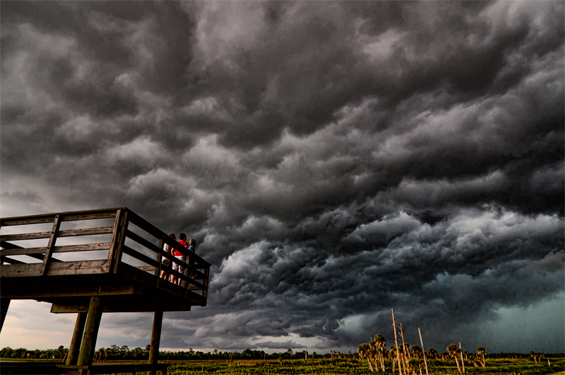
Had to enter another challenge with these marvelous storm clouds. Hope these bystanders are meeting the challenge. They were observing an action they were not a part of. Not sure how innocent they are, though. Yuk, yuk! :b
PP: Fixed the tilted horizon, cropped, adjusted color, ran Topaz Adjust(Drama)and noise suppression within Topaz Adjust. Really brings out the dark clouds!
Too much? Maybe. Scores don't lie. We'll see.
______________________________________
I can't believe it is 5th with this score, but I am very happy about it! :D
For Johanna... This is a Florida Wetlands area that they made into a park and actually is a swampy area with an observation deck. Viera Wetlands is favorite spot for photographers in this area to capture stunning nature shots. My only blue ribbon shotwas taken there.
Statistics
Place: 4 out of 57 Avg (all users): 6.2637 Avg (commenters): 6.7500 Avg (participants): 5.6250 Avg (non-participants): 6.3846 Views since voting: 2823 Views during voting: 444 Votes: 201 Comments: 12 Favorites: 1 (view)
Nice pic but I have some questions.....
Have the clouds at the top been selectively desaturated......?
The colours on the left and the right somehow don't appear the same - or from the same capture - slightly unnatural?
But overall excellent placing of elements in the frame.
Great angle.
The clouds were different colors in the original also. No selective desat in this photo. The sky was blue/grey/green. It was a really bad storm. Lots of lightning, wind and pouring rain later. The clouds were from the same capture. I used a heavy application of Topaz Adjust to make the clouds look meaner.
Hey... your title reminded me of a Letters to Cleo song I hadn't heard in 10 years...Big Star...though it starts 'There it goes again...' ...so I'm not sure why. Anyway, the sky is very ominous. The lighting on the people on the deck is interesting. I wish I could see the people better (i know they probably wouldn't be bystanders anymore) and could better associate the storm to a metaphor of life. -8
Nice pic but I have some questions.....
Have the clouds at the top been selectively desaturated......?
The colours on the left and the right somehow don't appear the same - or from the same capture - slightly unnatural?
But overall excellent placing of elements in the frame.
Great angle.
The deck and the bystanders and the sky are excellent but then I get drawn to the ground and it is not good at all.I am guessing you did some strong processing to make the sky very dramatic but it overdid the ground and looks off. Perhaps cropping out the ground would of helped, that or if this was advanced editing you could of masked the ground. As is it is a stunning image and would be a favorite of mine if it wasn't for the bottom of the photo. 6





 Add photograph to your favorites
 Add photographer to your favorites


 Photographer found comment helpful.


