| Author | Thread |
Comments Made During the Challenge  |
|
|
08/22/2010 09:42:37 PM |
|
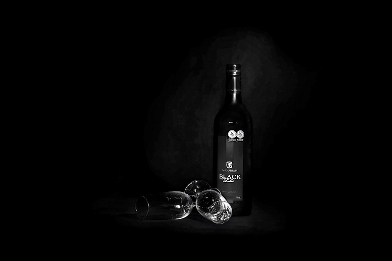
A tighter crop and less centered would make this better, imo. |
|
 Photographer found comment helpful. Photographer found comment helpful. |
|
|
08/22/2010 02:51:57 PM |
|
The delicate background lighting is a nice touch. I'm not sure if I like the centered composition |
|
| Photographer found comment helpful. |
|
|
08/21/2010 07:59:49 AM |
|
overused subject matter but very nicely done. maybe if you had cropped off a bit more of the right to give it a better rule of thirds feel i'd go a point higher but still good enough for a 6 |
|
| Photographer found comment helpful. |
|
|
08/18/2010 10:55:25 PM |
|
The idea itself seems kinda generic. But nice work with lighting. |
|
| Photographer found comment helpful. |
|
|
08/18/2010 07:11:12 PM |
|
i like the contrasty style of this photo, sharp rendering of glasses! |
|
| Photographer found comment helpful. |
|
|
08/16/2010 02:56:28 PM |
|
I like the bg lighting, but think there is too much negative space. Perhaps less of it on the right would make the left give the aura or impression of possibilities, but as it is, it's a bit much for me. |
|
| Photographer found comment helpful. |
Home -
Challenges -
Community -
League -
Photos -
Cameras -
Lenses -
Learn -
Help -
Terms of Use -
Privacy -
Top ^
DPChallenge, and website content and design, Copyright © 2001-2026 Challenging Technologies, LLC.
All digital photo copyrights belong to the photographers and may not be used without permission.
Current Server Time: 06/30/2026 09:49:37 AM EDT.