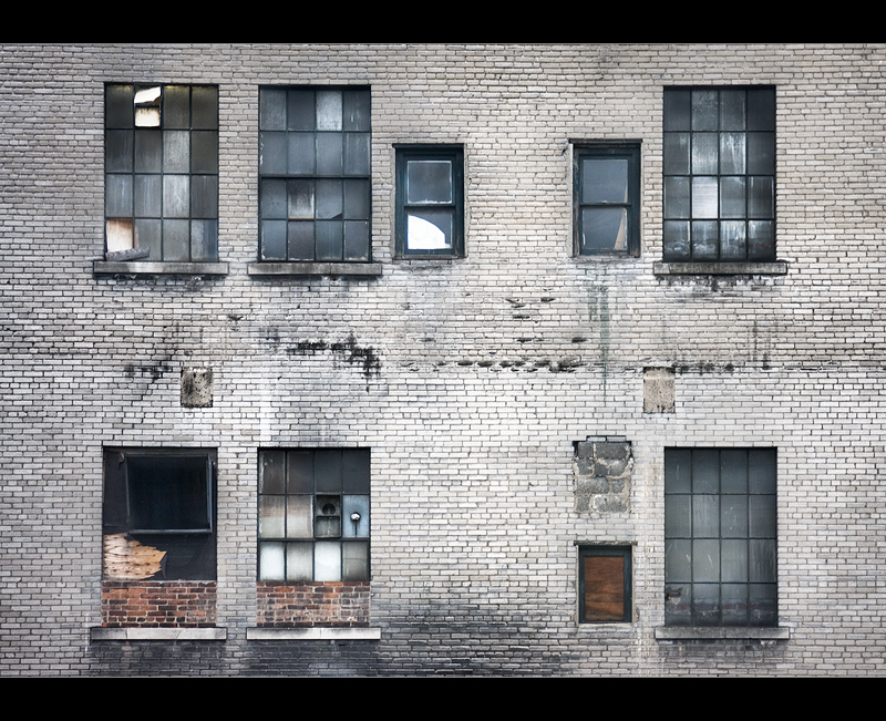
The symmetry really times this together. The white of the bricks gives this a different feel to the usual earthy palette in these kind of shots, and I like it :)
Ornamental and photographable. <--- Not a word yet but I'm working on it. :) Nice capture that may be a candidate for the minimalism challenge. Whatcha think? Is my interpretation of minimalism too broad?
I find it interesting that in every 7th layer, the bricks were turned the opposite way, 90 degrees to the previous layer.
The tones of grey make this look almost like a B&W shot except for the few red brick. I wonder how it would look if you did a selective desat, and kicked the red up a lot, or even go to all B&W or sepia.
so stark and nearly graphic .. I LOVE IT .. !!..:)
funny, it looks very like a place i took pics of a few weeks ago .. the bricks and the windows etc .. could almost be in the same street ... :)




 Add photograph to your favorites
 Add photographer to your favorites


 Photographer found comment helpful.


