| Author | Thread |
|
|
07/14/2004 04:44:01 PM |
|
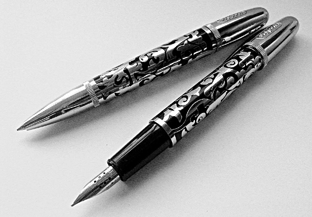
FAO: Goodman (in case you check back to find out where to get a Stypen). These were bought at Malaga airport some time ago. Sorry, but I don't know where you would buy them normally - maybe you know some good pen shops? |
|
|
|
07/14/2004 04:14:48 PM |
Was 'tickled pink' (that means I'm pleased) to get within the top 50. The pens were laid on writing paper with a 'grainy' surface, which may help to explain some of the graininess of the photo? I expect my levels of 'unsharp' caused the grainy look on the pens - though I quite liked the effect myself.
Wanted, originally, to post in colour but there was a small red reflection on the fountain pen, which I knew would cost me some points. Desaturation to B&W, I thought, worked well for the challenge. I still have a lot to learn about photography though and being active on this site helps me to look at my photos more objectively. Special thanks for all the comments and suggestions that people take the time and effort to make. Thank you. |
|
Comments Made During the Challenge  |
|
|
07/13/2004 08:21:27 PM |
|
Seems grainy/choppy. Nice composition. |
|
 Photographer found comment helpful. Photographer found comment helpful. |
|
|
07/13/2004 01:57:52 PM |
|
| Photographer found comment helpful. |
|
|
07/12/2004 10:37:09 AM |
|
right out of a magazine ad... well done. composition leads with diagonals and lighting shows off the product well. graininess also a plus one of my ribbon picks. |
|
| Photographer found comment helpful. |
|
|
07/11/2004 02:59:35 PM |
wow, nice pens, where can i get one?
background seems a bit noisy? |
|
| Photographer found comment helpful. |
|
|
07/11/2004 05:34:58 AM |
|
I don't like the grain, it takes away the sharpness and style that the chrome and balck reflections otherwise would have expressed. |
|
| Photographer found comment helpful. |
|
|
07/10/2004 11:23:25 PM |
|
Ahhh, now that speaks to me, a writer. Nice shot; very becoming in black and white. 9 |
|
| Photographer found comment helpful. |
|
|
07/09/2004 02:49:07 AM |
|
I like the B&W and grain treatment for this one...very nice. |
|
| Photographer found comment helpful. |
|
|
07/08/2004 09:07:09 PM |
|
Crisp focus on the entire product, good. Nicely designed framing, good. Pretty significantly overhsharpened, not so good. |
|
| Photographer found comment helpful. |
|
|
07/08/2004 12:35:40 PM |
|
It might have been more effective if you wrote that copy on the paper in flowy (but readable) script, showing the output of the product and adding a bit more flair to the composition. It is rather static and dull, as it is. |
|
| Photographer found comment helpful. |
|
|
07/07/2004 05:36:30 PM |
|
Great clear shot. The only think I dont like is the texture of the background, it kinda looks like noise, although im pretty sure its just the texture? |
|
| Photographer found comment helpful. |
|
|
07/07/2004 01:53:42 PM |
|
| Photographer found comment helpful. |
|
|
07/07/2004 10:55:45 AM |
|
I think this is a perfect shot marred only by unbearable graininess. The textured background should offset the sleek, smooth pens, but they are so grainy that they don't stand out as is. Not sure if this was to do with post processing or not, but try to reprocess it if so. I love the pose, the simplicity, everything else, just the graininess bothers me. |
|
| Photographer found comment helpful. |
|
|
07/07/2004 03:57:40 AM |
|
color would have been more effective |
|
| Photographer found comment helpful. |
|
|
07/07/2004 02:00:38 AM |
|
Aha a fountain pen. We collect fountain pens but don't have any stypens yet. This is a nice picture of the two pens, well presented. I think the black and white works because it connects these modern pens to the pens of the past. |
|
| Photographer found comment helpful. |
Home -
Challenges -
Community -
League -
Photos -
Cameras -
Lenses -
Learn -
Help -
Terms of Use -
Privacy -
Top ^
DPChallenge, and website content and design, Copyright © 2001-2026 Challenging Technologies, LLC.
All digital photo copyrights belong to the photographers and may not be used without permission.
Current Server Time: 06/29/2026 09:31:24 AM EDT.