| Author | Thread |
|
|
12/12/2007 05:56:07 PM |
|
Interesting lighting and lovely blue tones in this |
|
 Photographer found comment helpful. Photographer found comment helpful. |
Comments Made During the Challenge  |
|
|
07/13/2004 04:30:57 PM |
|
must be a winner, but strange background bahavior |
|
| Photographer found comment helpful. |
|
|
07/13/2004 04:11:18 PM |
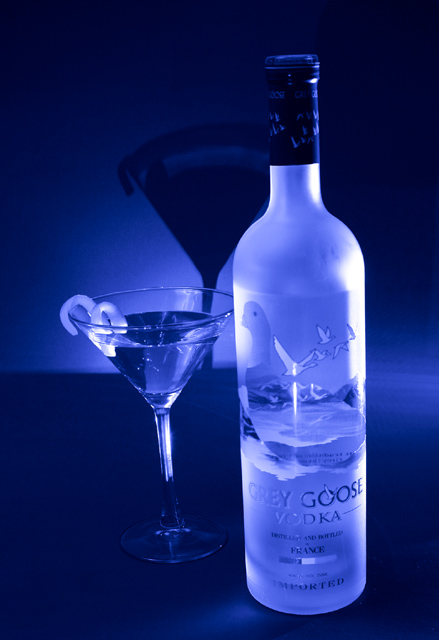
Blue always does very well in DPC :-)
This is a great image. A criticizm is that the glass looks crooked, but still pretty good. |
|
| Photographer found comment helpful. |
|
|
07/13/2004 04:03:17 PM |
|
| Photographer found comment helpful. |
|
|
07/13/2004 02:15:29 PM |
|
Nice colors and good use of the blue light. It would be much better if it was not tilted. |
|
| Photographer found comment helpful. |
|
|
07/12/2004 06:44:13 PM |
|
Makes me want to try some and I'm a rum girl! |
|
| Photographer found comment helpful. |
|
|
07/12/2004 05:00:31 PM |
|
| Photographer found comment helpful. |
|
|
07/12/2004 02:57:18 PM |
|
Mmm.... Grey Goose! I find the shadow of the glass behind distracting, especially since there's no shadow on the vodka bottle. Nice lighting, though! |
|
| Photographer found comment helpful. |
|
|
07/11/2004 01:21:05 AM |
|
| Photographer found comment helpful. |
|
|
07/11/2004 12:57:44 AM |
|
nice photo, but just a bit crooked 7 |
|
| Photographer found comment helpful. |
|
|
07/10/2004 09:41:05 PM |
|
I love the blue tones captured through the entire picture Nice, clear focus throughout. The bottle and glass appear to be leaning to the left. Maybe a bit of rotation would have helped. |
|
| Photographer found comment helpful. |
|
|
07/10/2004 06:02:12 PM |
|
Love the glow color and the shadow in the back. |
|
| Photographer found comment helpful. |
|
|
07/10/2004 12:35:16 PM |
|
This is a lovely picture. I might have moved the shadow away from the bottle just a bit. As an advertisement, the only problem is that part of the Grey Goose logo is difficult to see. |
|
| Photographer found comment helpful. |
|
|
07/10/2004 01:54:09 AM |
|
Leans to the left. I like the blue lighting, but I don't like the shadow. |
|
| Photographer found comment helpful. |
|
|
07/09/2004 08:20:29 PM |
|
Great colors. Is that in the lighting? |
|
| Photographer found comment helpful. |
|
|
07/09/2004 05:33:16 PM |
|
Nice. But...there is some tilt in the shot. |
|
| Photographer found comment helpful. |
|
|
07/09/2004 04:46:17 PM |
|
I like it, nicely done. The blue coloring gives it that "cold drink" feeling. |
|
| Photographer found comment helpful. |
|
|
07/09/2004 02:43:36 PM |
|
nice pic, but slightly slanted. a simple straighten of the pic would have made this picture great. |
|
| Photographer found comment helpful. |
|
|
07/09/2004 01:25:33 PM |
|
Good idea, but in my opinion there are a couple of things that would improve this shot. First I think the slightly tilted camera makes this look funny- I would rather see the bottle and glass vertical. Second, for an advertisement shot, I think a little highlighting of the name on the bottle is appropriate. The "grey" and the "vodka" sort of blend into the bottle and are hard to read. |
|
| Photographer found comment helpful. |
|
|
07/09/2004 11:28:51 AM |
|
The bottle and glass look tilted. Otherwise, very good. |
|
| Photographer found comment helpful. |
|
|
07/08/2004 10:48:17 PM |
|
The blue background really sets the mood. Too bad the bottle and glass look tilted a little. |
|
| Photographer found comment helpful. |
|
|
07/08/2004 09:19:30 PM |
|
Dang -- so very close to a 10, but you can't read the label, and there's a very hot highlight down the middle. Sell the product not the prop, glasshoppah. |
|
| Photographer found comment helpful. |
|
|
07/08/2004 05:57:47 PM |
|
I love the colors in the picture. its hard to see the words on the bottle for the advertisement |
|
| Photographer found comment helpful. |
|
|
07/08/2004 04:11:44 PM |
|
| Photographer found comment helpful. |
|
|
07/08/2004 04:00:05 PM |
|
needs to be straigher unless you've already drank some |
|
| Photographer found comment helpful. |
|
|
07/08/2004 01:22:24 PM |
|
Nice hint of blue.....i like it. |
|
| Photographer found comment helpful. |
|
|
07/08/2004 09:16:30 AM |
|
would be better a bit straighter...but still a nice shot |
|
| Photographer found comment helpful. |
|
|
07/07/2004 11:22:08 PM |
|
Wow, beautiful. Ony one thing...is the glass tilted???? |
|
| Photographer found comment helpful. |
|
|
07/07/2004 05:59:57 PM |
|
Nice cool looking picture. Like the shadow. I think it is slightly tipped to the left however. It would be better straight up. I still give it an 8. |
|
| Photographer found comment helpful. |
|
|
07/07/2004 04:53:32 PM |
|
Excellent picture, very good Incident light. |
|
| Photographer found comment helpful. |
|
|
07/07/2004 02:00:28 PM |
|
Very cool effect. Would have prefered bottle perpenducular, but otherwise a fantastic shot. |
|
| Photographer found comment helpful. |
|
|
07/07/2004 11:45:08 AM |
|
I like your idea and set up here. The little fruit twist in the glass is a nice touch. Maybe you meant to, but I think the bottle and glass seem tilted to the left. Sometimes that works, but in this case I think it might be better straightened out. |
|
| Photographer found comment helpful. |
|
|
07/07/2004 08:19:44 AM |
|
a bit tilited -- you've capture the mood with the blue monochrome. |
|
| Photographer found comment helpful. |
|
|
07/07/2004 01:47:40 AM |
|
Beautiful shot with nice color. It would be better if it were straightened out a bit and if I could see the name of the vodka more clearly, but it's a very nice shot. |
|
| Photographer found comment helpful. |
|
|
07/07/2004 01:02:02 AM |
|
Perfect, the lighting, the message, the only problem I have with this images the tilting. A 9! |
|
| Photographer found comment helpful. |
|
|
07/07/2004 12:38:40 AM |
|
I agree! I like the "ambiance" of your picture... Well done! a9 |
|
| Photographer found comment helpful. |
|
|
07/07/2004 12:23:55 AM |
|
Supurb photo, but It looks like somethings crooked or slanted, i guess just an optical illusion from the shadow- but it's a tad distracting. Other than that, great |
|
| Photographer found comment helpful. |
Home -
Challenges -
Community -
League -
Photos -
Cameras -
Lenses -
Learn -
Help -
Terms of Use -
Privacy -
Top ^
DPChallenge, and website content and design, Copyright © 2001-2026 Challenging Technologies, LLC.
All digital photo copyrights belong to the photographers and may not be used without permission.
Current Server Time: 06/28/2026 08:27:52 AM EDT.