| Author | Thread |
Comments Made During the Challenge  |
|
|
07/13/2004 04:02:04 PM |
|
|
|
07/13/2004 12:22:36 PM |
|
Great composition. Nice lighting. |
|
 Photographer found comment helpful. Photographer found comment helpful. |
|
|
07/12/2004 04:28:18 PM |
|
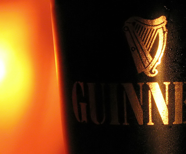
Cool image! It's a little contrasty, in that the highlights are blown out slightly, and the shadow detail on the guinnes label could be slightly lighter. It is instantly guinnes though. |
|
| Photographer found comment helpful. |
|
|
07/12/2004 02:28:35 AM |
|
| Photographer found comment helpful. |
|
|
07/11/2004 10:49:26 PM |
|
I absolutely love this shot. the lighting is perfect. |
|
| Photographer found comment helpful. |
|
|
07/11/2004 07:36:23 PM |
|
I think this would have worked much better in B&W. |
|
| Photographer found comment helpful. |
|
|
07/10/2004 04:12:22 PM |
|
Do you know that when I first saw it on the screen at work, I jus saw the "N" and didn't know excactly theat ad was for! So, good but perhaps too much contrast. |
|
| Photographer found comment helpful. |
|
|
07/10/2004 11:22:01 AM |
|
Excellent! Best one I've seen so far. Getting the saturated glints just right while still having the darkest letters legible must have been quite a trick. |
|
| Photographer found comment helpful. |
|
|
07/09/2004 07:08:13 PM |
|
This is beautiful! I love Guiness! |
|
| Photographer found comment helpful. |
|
|
07/09/2004 01:40:50 PM |
One of the stronger images in the challebge - and actually looks like it belongs on a page, TV or billboard. The light on the left is too strong though and I feel that a tighhter crop on the glass would bring the eye towards the product more.
Message edited by author 2004-07-14 00:51:07. |
|
| Photographer found comment helpful. |
|
|
07/08/2004 10:25:22 AM |
|
I like the choice of colors and the contrast. Reflected light is powerful. I think a little more light from the left and possibly from behind the camera would have lightened the rest of the brand name a bit and possibly have improved it. |
|
| Photographer found comment helpful. |
|
|
07/08/2004 06:05:32 AM |
|
Guinness? I think one of the first rules of advertising is make sure the product name is visible. I'm just guessing this is Guinness based on the gold and black. |
|
| Photographer found comment helpful. |
|
|
07/07/2004 11:29:55 PM |
|
This is interesting in an abstract sense, but I can't tell what the product is! |
|
| Photographer found comment helpful. |
|
|
07/07/2004 11:17:28 PM |
|
better than mothers milk! Nicely done |
|
| Photographer found comment helpful. |
|
|
07/07/2004 10:35:45 PM |
|
i would love this if perhaps a reflector was used to bring some light into the darkest area of the photo - the right side of the U and the I are almost completely lost. Otherwise, nice close-up, detail, sharpness and color. (display recently calibrated with OptiCAL) |
|
| Photographer found comment helpful. |
|
|
07/07/2004 06:18:10 PM |
|
A beer lover might not get it, but it works for me. Nice shot! |
|
| Photographer found comment helpful. |
|
|
07/07/2004 05:50:52 PM |
|
Excellent use of light and color. This would get the buyer's attention. |
|
| Photographer found comment helpful. |
|
|
07/07/2004 05:28:44 PM |
|
I dont know if its my monitor but i cant see the product. Is it guinsess? |
|
| Photographer found comment helpful. |
|
|
07/07/2004 03:05:53 PM |
|
The light to the left soes not seem to have anything to do with the product, who's whole name we can't see. |
|
| Photographer found comment helpful. |
|
|
07/07/2004 01:58:11 PM |
|
Just a little too dark on the words... but a nice shot still -8 |
|
| Photographer found comment helpful. |
|
|
07/07/2004 12:49:46 PM |
|
with the lighting and the angle, you cant tell what its advertising. i like the orange though |
|
| Photographer found comment helpful. |
|
|
07/07/2004 11:48:17 AM |
|
|
|
07/07/2004 09:17:43 AM |
|
Nice photograph, but not sure that heat and beer work together... |
|
| Photographer found comment helpful. |
|
|
07/07/2004 08:09:19 AM |
|
|
|
07/07/2004 04:28:45 AM |
|
OH, this loosk good, yammi ;) Great light, very warm. Maybe your should have shown a bit more of teh label, so one could guess what it says... |
|
| Photographer found comment helpful. |
|
|
07/07/2004 12:43:37 AM |
|
I love the golden glow. It gives a great feeling of richness. Nice cropping. I would have been tempted to show the entire logotype but it's still recognizable and a perfect choice. |
|
| Photographer found comment helpful. |
Home -
Challenges -
Community -
League -
Photos -
Cameras -
Lenses -
Learn -
Help -
Terms of Use -
Privacy -
Top ^
DPChallenge, and website content and design, Copyright © 2001-2026 Challenging Technologies, LLC.
All digital photo copyrights belong to the photographers and may not be used without permission.
Current Server Time: 06/30/2026 03:42:53 AM EDT.