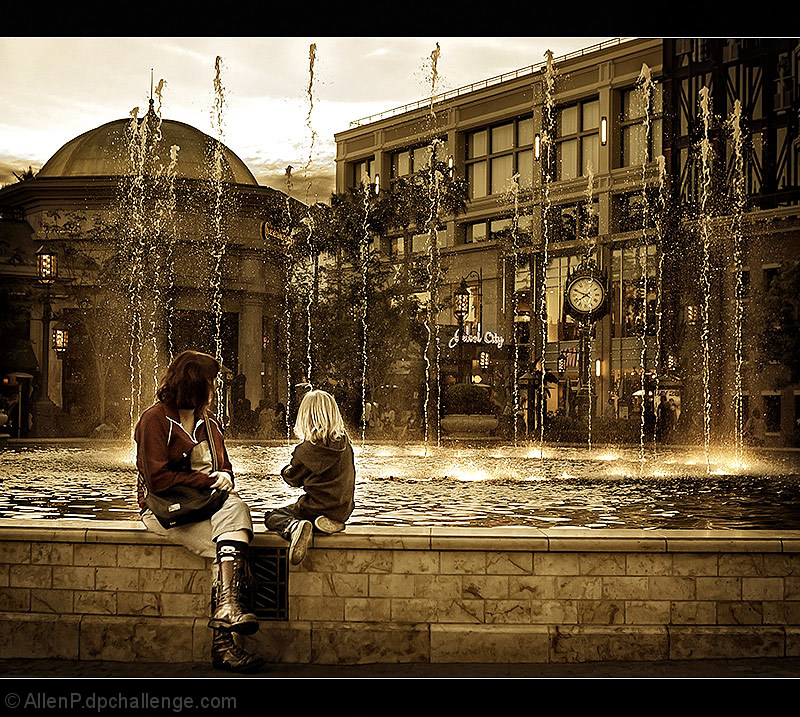
I love the processing on this. The tilt seems a little off. I wonder if it would be better straightening on the horizontal top of the fountain or the uprights of the building/streetlight. 10 if it didn't feel tilted. 9 anyway because of the colors/processing and overall shot. Beautifully done.
Beautiful photo! The colors are perfect, and the location is great. It does seem like the photo isn't quite level, which is distrating me ever so slightly.
its probably just me, but i see a faint heart shape created by the two figures that just adds to this image for me. i really dislike the letterbox border though.







 Add photograph to your favorites
 Add photographer to your favorites

 Photographer found comment helpful.


