| Author | Thread |
Comments Made During the Challenge  |
|
|
07/13/2004 04:10:57 PM |
|
|
|
07/11/2004 11:21:25 AM |
|
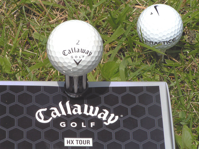
Its not saying much for Nike. I don`t use either, well done 8 |
|
|
|
07/11/2004 01:50:34 AM |
|
Over-exposed on the ball. I think I would have omitted the Nike part altogether. |
|
|
|
07/11/2004 01:39:02 AM |
|
There is some glare on the top of the balls and a shadow! Also looks a little washed out. Tweeking the contrast would have helped I think. Great idea though. |
|
 Photographer found comment helpful. Photographer found comment helpful. |
|
|
07/10/2004 11:32:28 PM |
|
I like the texture of the grass and the way you have framed this shot. The tops of both of the balls seem to be over exposed. |
|
|
|
07/10/2004 06:13:57 PM |
|
a little too bright and little too little contrast but a great composition |
|
| Photographer found comment helpful. |
|
|
07/10/2004 05:23:44 PM |
|
A bit too bright on the top of the golf ball. Shadow underneath the golf ball a little distracting. Suggestion would be to have this photo shot on the green (smoother surface) on a golf course. This photo/advertisement has a lot of potential! |
|
| Photographer found comment helpful. |
|
|
07/10/2004 05:47:44 AM |
|
Your balls are, err, over exposed... :-). Some sort of diffuser above this shot would have helped, some drafting film, thin paper, something to soften the direct light (Sun?) |
|
| Photographer found comment helpful. |
|
|
07/09/2004 09:13:56 PM |
|
The reflection of the balls are to bright. It looks like the white is having a bleaching affect on the grass. |
|
| Photographer found comment helpful. |
|
|
07/08/2004 01:38:22 PM |
|
I like how you show the difference between the two. The balls look a bit over exposed. Good idea. |
|
| Photographer found comment helpful. |
|
|
07/08/2004 10:05:17 AM |
|
Great concept and I really like the tag line in your title. Focus, contrast and DOF are all good. The thing I find that detracts a bit is the composition. Think about the rule of thirds and consider a different crop. Color seems just a bit flat. Perhaps shooting earlier or later in the day would have helped. |
|
| Photographer found comment helpful. |
|
|
07/07/2004 11:36:43 AM |
|
Do you really want to show a competitor's ball in the ad? This wouls also work better on manicured grass or astroturf, the lawn grass is distracting. Nice shot, try for a bit more contrast on the bal, the top edge is washed out. |
|
|
|
07/07/2004 09:11:05 AM |
|
Nicely composed, but the image seems pretty over-exposed. Might want to try this one again either earlier or later in the day. I like the slogan. |
|
| Photographer found comment helpful. |
|
|
07/07/2004 04:11:32 AM |
|
Neat idea but the highlights appear cilipped, taking out the detail of the balls. |
|
|
|
07/07/2004 01:12:05 AM |
|
Looking forward to trying the new hx tour balls. |
|
Home -
Challenges -
Community -
League -
Photos -
Cameras -
Lenses -
Learn -
Help -
Terms of Use -
Privacy -
Top ^
DPChallenge, and website content and design, Copyright © 2001-2026 Challenging Technologies, LLC.
All digital photo copyrights belong to the photographers and may not be used without permission.
Current Server Time: 06/28/2026 07:28:29 PM EDT.