| Author | Thread |
|
|
05/19/2010 07:54:14 PM |
|
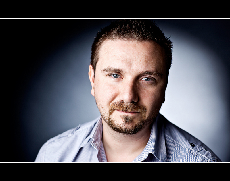
I like the portrait. And the lighting. Nice work. |
|
 Photographer found comment helpful. Photographer found comment helpful. |
|
|
05/19/2010 04:06:01 AM |
|
| Photographer found comment helpful. |
|
|
05/19/2010 12:08:26 AM |
|
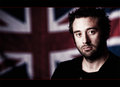
Oh I know that face.....top bloke...shame about the accent though...hehehehehe! Ask Simms about that one! |
|
| Photographer found comment helpful. |
|
|
05/19/2010 12:05:34 AM |
|
VERY cool that the two you placed back to back with your portraits! |
|
| Photographer found comment helpful. |
Comments Made During the Challenge  |
|
|
05/17/2010 11:37:27 PM |
|
So that's him, huh? Ruggedly handsome fellow he is :) And a very nice job photographing him!! |
|
| Photographer found comment helpful. |
|
|
05/16/2010 08:39:47 PM |
|
| Photographer found comment helpful. |
|
|
05/16/2010 12:25:53 PM |
|
so you grow a beard and then disappear out of my life! lovely, just lovely! 9. is this Mak? |
|
| Photographer found comment helpful. |
|
|
05/14/2010 11:35:33 AM |
|
This one has great DOF, part of me wants to say that you shouldn't have cropped his head so tight at the top, but the more I look at it, the more I like it... If I HAD to come up with one thing to say it would be that the light on the backdrop should be the same brightness on both his left and right... it's a little too bright on one side as thought you lit it with a light from the side... try placing the light reight behind him so that lighting is even on left and right... but STILL I really think this shot is AMAZING! |
|
| Photographer found comment helpful. |
|
|
05/14/2010 11:13:06 AM |
|
Excellent portrait !! it is good to know what this guy looks like, it will now be even more enjoyable to read his sarcastic comments. (not voting) |
|
| Photographer found comment helpful. |
|
|
05/13/2010 08:59:00 AM |
|
The eyes are nice and sharp and use of lighting was good. Subject feels too centered but just off center... I'm not sure if it bugs me or not and if I think that then it probably does |
|
| Photographer found comment helpful. |
|
|
05/13/2010 08:53:18 AM |
|
it is a good picture but i think it is alittle wide. 6 |
|
| Photographer found comment helpful. |
|
|
05/13/2010 12:52:31 AM |
|
nice lighting and shallow dof works well in this. i like the wide crop but not the black borders on this. normally i do like the black but i think this shot would be best without. :) |
|
| Photographer found comment helpful. |
|
|
05/12/2010 06:57:31 PM |
|
very professional portrait. (not voting) |
|
| Photographer found comment helpful. |
|
|
05/12/2010 03:56:57 AM |
|
Looks like you pulled him out of a tv ad trying to push insurance or something haha. |
|
| Photographer found comment helpful. |
|
|
05/12/2010 03:37:25 AM |
|
He really does look like an a-hole! :P Just kidding! I love that guy. I mean that in a platonic way - not like love-love. ...not that there's anything wrong with that. Haha. Just funnin. This is a fantastic portrait! an easy 10 from me. |
|
| Photographer found comment helpful. |
|
|
05/12/2010 03:03:36 AM |
|
Lovely portrait of Simms, the lighting is spot on. Looks like he has lost some weight! |
|
| Photographer found comment helpful. |
Home -
Challenges -
Community -
League -
Photos -
Cameras -
Lenses -
Learn -
Help -
Terms of Use -
Privacy -
Top ^
DPChallenge, and website content and design, Copyright © 2001-2026 Challenging Technologies, LLC.
All digital photo copyrights belong to the photographers and may not be used without permission.
Current Server Time: 06/30/2026 05:48:09 AM EDT.