| Author | Thread |
|
|
12/02/2002 09:30:00 PM |
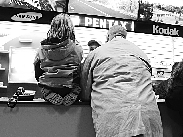
(1) COMPOSITION (CONTENT) - Pretty good. I’d like to see the partial bodies on the right cropped out. The problem with that, you lose the Kodak sign. Can’t win. I like the partial face in the center, although a couple of folks did not. It’s good that he is looking at her. I like the pose of the girl, kneeling on the counter. Definite youth, paying attention.
(2) BACKGROUND – Pretty good, but two “blown out” areas are distracting – left of the girl’s arm, and right of her head. Looks like bad reflections. Overall background is also a little too bright, but probably hard to change in b&w.
(3) CAMERA WORK ,TECHNICAL – Focus and DOF look quite good.
(4) DIGITAL PROCESSING ,TECHNICAL – I assume you took this in color and converted to B&W. The conversion looks good to me. Good resulting textures. No recommended changes.
(5) MY OPINION ON THE PHOTO – When I first saw the photo and the title, I had trouble envisioning the story that went with it. A good picture, but “so what”; why would this be on a front page or a magazine cover? On the other hand, it would go well with a story on a “variety” page that covered a young girl who took photos for a school paper.
Jim msp
Critique Club
|
|
Comments Made During the Challenge  |
|
|
12/01/2002 07:36:00 AM |
|
Did your finger get stuck on the H key? I don't understand the title... |
|
|
|
11/30/2002 05:23:00 PM |
|
Ok. Too bad there is any of the clerk's face in this one. Perhaps you should have ducked a bit right and got him out of it entirely. |
|
|
|
11/30/2002 04:53:00 PM |
|
I can just feel the enthusiasm and interest of the girl. Great job and works well in black and white(10) |
|
|
|
11/29/2002 01:06:00 AM |
|
there's a great story in this picture. |
|
|
|
11/28/2002 08:09:00 PM |
|
I hope they bought the kid a camera! Interesting use of high-contrast B+W helps focus on the characters/story rather than the advertising, while using the displays to provide context. |
|
|
|
11/28/2002 05:17:00 PM |
This is a good one! Especially after voting on 'Rest In Peace Little Angels...'.
Strong impression of childhood and well captured.
|
|
|
|
11/28/2002 11:19:00 AM |
|
aww totally precious. maybe crop a bit tighter would give it more oomph.alt title: "Buddy Don't Make Me Come Over This Counter!" :P :) mag99 |
|
|
|
11/27/2002 09:35:00 PM |
|
i like the salesman's eye. the far wall below the brand names is a little blown out, wonder if that's what had to go if you were gonna get the wrinkles on the jackets or the details of their hair. real nice, kinda wonder why you chose black and white though, 'cause there looks to be a lot of color here. |
|
|
|
11/27/2002 12:26:00 PM |
|
More of a candid than true PJ, but I'm not knocking points off for that this week. Too much reflection behind the sales counder, and the pic doesn't have much of a real point to me. Sorry, good luck! 5 nards656 |
|
|
|
11/27/2002 01:51:00 AM |
|
This is just classic. Too bad the lighting is too harsh off the poster. 8 |
|
|
|
11/26/2002 08:07:00 PM |
|
Its got a lovely feel to it, but I think that the extreme tilt should be corrected. |
|
|
|
11/26/2002 08:50:00 AM |
|
Background is a bit blown out so don't really get the impression of it being a camera store. |
|
|
|
11/25/2002 04:43:00 PM |
|
Cute cute shot!! GREAT eye. Well done. Justine |
|
|
|
11/25/2002 12:16:00 PM |
|
V.Good contrast between the two figures with the salesmans perplexed face in between--great image andrewm |
|
|
|
11/25/2002 09:23:00 AM |
|
Great shot, but light and focus a little harsh. Good composition. Nice execution. Good crop. Nice shot. PTL6 |
|
|
|
11/25/2002 01:51:00 AM |
|
In photojournalism, expressions are always very important. You always want to see the peoples faces and feel their emotions |
|
Home -
Challenges -
Community -
League -
Photos -
Cameras -
Lenses -
Learn -
Help -
Terms of Use -
Privacy -
Top ^
DPChallenge, and website content and design, Copyright © 2001-2026 Challenging Technologies, LLC.
All digital photo copyrights belong to the photographers and may not be used without permission.
Current Server Time: 06/28/2026 10:54:35 AM EDT.