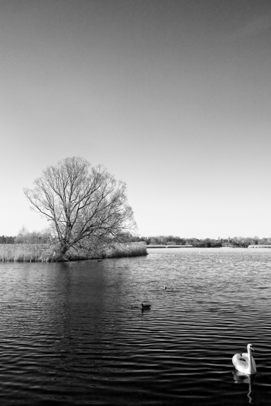
There are many times that I like an animal pushing the limits of the frame, but with the swan, I think it ended up looking squished.
In this photo the swan is by far the most interesting part. I love the set of his wings and the darker water with the reflection. Unfortunately, the rest pales in comparison and overwhelms the image. The sky is a large part of the photo, but doesn't hold any interest. It ends up centering the tree, which I think would have been better off not centered. Sorry, it just doesn't work, imo.
I just want to grab that swan and turn her around so she is swimming into the image rather than out of it. I like how the white swan is against the blackest part of the scene.
Nice composition in this. I like how the swan, duck and tree line up. Top half of the picture seems predominantly gray, though, so that makes the overall shot feel gray, I think.
It almost feels as though the swan is falling out of the photo. I would have felt more comfortable if there was just a bit more space between the swan and the edge of the frame.





 Add photograph to your favorites
 Add photographer to your favorites


 Photographer found comment helpful.


