| Author | Thread |
|
|
05/09/2010 12:14:33 PM |
|
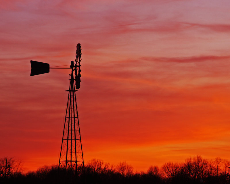
Colors, tones, and composition here is beautiful. The rest of the crew have given you good insights to the point I can add nothing (although I too fully recommend cloning those wires out:-)). Good Luck with the challenge! |
|
|
|
05/08/2010 10:14:37 PM |
|
This is beautiful. The windmill itself looks a bit soft to me. If you reprocess, maybe you can sharpen in several small stages - or whatever you do - but if it were somewhat crisper, I think it would benefit the image. That said, the colors are outstanding. I'd also chop off a little from the left. There's a thing on the bottom left that doesn't really fulfill a purpose in the composition. |
|
|
|
05/08/2010 08:58:25 PM |
|
I'm going to go from the original and bring it back to this. I processed this with a JPEG and I am going to do the process with a TIFF. It is relatively easy to get to this image because the lighting is just about right in the original. Plus I see some haloing around the windmill and of course the cloning of the wires. |
|
|
|
05/08/2010 08:55:00 PM |
|
this is very well done...I would enter this...just do a little more dressing with it... |
|
|
|
05/08/2010 08:54:16 PM |
|
I have three different windmills that I use in my shots. My FS is one of them. This one is in a small subdivision that sits outside of the town I live in. The other has a lot of trees around it but still there is a clear directly around it. |
|
|
|
05/08/2010 08:14:57 PM |
|
This is wonderful!..I can never find one these that the background isn't crappy...Nice |
|
|
|
05/08/2010 07:16:43 PM |
I totally agree with Janine. That's the only thing in this shot that I don't like.
Another thing I'd try... the bottom where the trees meet the sky seems a tad strange. I was thinking... if you make a hue/sat layer and decrease just the saturation of the reds (just a little) and then mask it out on the sky, except where it touches the trees. Does that make sense? |
|
|
|
05/08/2010 07:09:06 PM |
|
Kevin, this is very, very lovely...clone out the power lines in the bottom as much as you can...other than that...this is really, really nice...love the colors |
|
|
|
04/19/2010 04:01:17 PM |
|
Fantastic colors, great photo! |
|
 Photographer found comment helpful. Photographer found comment helpful. |
|
|
04/04/2010 04:07:08 PM |
|
wonderful color...this is beautiful |
|
| Photographer found comment helpful. |
Home -
Challenges -
Community -
League -
Photos -
Cameras -
Lenses -
Learn -
Help -
Terms of Use -
Privacy -
Top ^
DPChallenge, and website content and design, Copyright © 2001-2026 Challenging Technologies, LLC.
All digital photo copyrights belong to the photographers and may not be used without permission.
Current Server Time: 05/31/2026 01:40:09 PM EDT.