Converted to b/w using the channel mixer. Dodged and burned a bit, cloned a little distracting leaf from the upper right corner, then used the sepia photo filter, resized for dpc and used unsharp mask.
As usual, I'm sort of going by my clouded memory when I recite those steps. I took and edited over 40 pictures from Glacier Park today and I *think* that's approximately what I did. :)
My hubby liked it so I figured I'd submit it, though I know there's going to be an awful lot of stiff competition!
Statistics
Place: 3 out of 384 Avg (all users): 7.3171 Avg (commenters): 8.6667 Avg (participants): 7.2517 Avg (non-participants): 7.5000 Views since voting: 8218 Views during voting: 324 Votes: 205 Comments: 52 Favorites: 53 (view)
Just ran aross this stunning panorama. Great use of tones with the grayed sepia filter. Beautiful contrast and light. The sky reflecting in the water is awe inspiring!
What a terrific capture Jodie! Congrats on getting your second ribbon so soon after your first. The more I look at your picture, the better it gets. I hope to one day be able to take a landscape picture as good as you do!
This is a first for me..getting all three ribbon winners correct.
Also the first time that I`ve taken all three as favourites.
Beautiful image Jodie..Congratulations.
Congratulations on a well-deserved ribbon! I'm sorry, but I think the comparisons to Ansel Adams are entirely appropriate. He would be proud of you!! I look forward to seeing more of your work.
I'm terribly humbled by all of the comparisons to Ansel Adams. It's definitely not in THAT category, but I am very pleased with this image. This is the first black and white image I've ever done that I've been really, truly happy with. The full resolution image is really full of detail taht you can't come close to seeing in this.
For those who wished it was in color, there was a haze that day that turned the distant mountains into a really ugly blue. The black and white improved it drastically. I'll post the original tomorrow so folks can see the difference.
Thank you all so much for liking the image. Now I can make my hubby take me out to dinner again since I got another ribbon! ;)
upper section of the sky seems burned heavily compared to rest of sky, don't know that it helps the image (don't know what the original looks like). Otherwise, I like it, nice detail and mood.
i think I would have cropped out a bit of the top of the shot (darker bit of the sky) just to balance the shot a bit, but its very dramatic in any event! :)
I like the strong contrast type of photo but I think the top of the sky was darkened a bit too much and is a bit distracting. Details of eveything from the trees to the rocks on the mountains to the distant clouds is amazing.
NICE job of varying the standard postcard image with careful metering. I LOVE this! That incredible (polarized?) sky and the reflections in the water make my little hart go pitty-pat! Must have been gorgeous taking Going-to-the Sun that day! 8
This is a gorgeous photo! I might lighten the levels a bit, a lot of the beauty gets lost in the dark areas. I like that it is in black and white, but I wonder if the color version would show the true beauty of this spot? I would love to be sitting there right now!







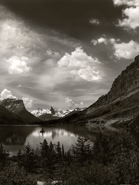
 Saint Mary's Lake
 Add photograph to your favorites
 Add photographer to your favorites


 Photographer found comment helpful.


