CRITIQUE CLUB CRITIQUE
by karmat
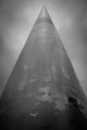
First off, I really like the "expansive" feeling of this shot.
Compositionally, you have done will with the symmetry. Also, the man on the left really adds to the shot, I think, by giving the shot some "scale," but also some "human-ness." Without him, the shot would be just another of a huge monolithic, impersonal structure.
Technically, I like the subdued colors in this. In the upper part, though, it is a bit noisy/grainy, perhaps from post processing. While the grain, per se, doesn't bother me, and perhaps adds to the shot in some ways, across the top of the arch is colored artifacts, and that just seems to detract some.
Overall, very well done, and I'm surprised it didn't score a bit higher.
Karma |