| Author | Thread |
|
|
02/03/2010 01:34:55 PM |
Greetings from the Critique Club.
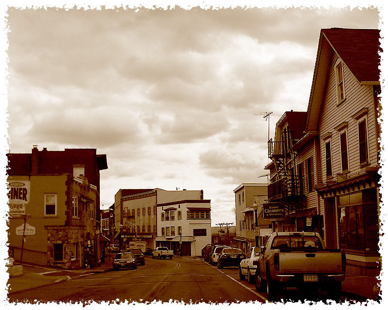
First impressions are that this is a pleasing shot with an old-time feel
Technically this is fine. The clouds stand out nicely to add a bit of drama. Composition is good but maybe a lower POV to have more of the buildings in the shot - the point is the town rather than the sky isn't it? The slight noise in the image adds to the old-time feel - was that added in PP as the camera settings don't seem to be such that they's add that much noise.
Artistically this is a bit flat. There is nothing of interest in the scene. We can't even see the cable car that your comments refer to. This is why the shot got so many 5's (my vote being one of them). Usually I can't stand fancy borders but in this instance it works.
In summary this is a solid shot (with a solid 5 score) but the scene lacks anything to engage the viewer.
Feel free to PM me if you have any queries.
Gerry |
|
 Photographer found comment helpful. Photographer found comment helpful. |
Comments Made During the Challenge  |
|
|
02/02/2010 09:37:03 PM |
|
I gave this a 5 in spite of the quality of the shot and processing. The border is a bust however (seriously). Give it up in the future and let the art of the photograph stand on its own. |
|
| Photographer found comment helpful. |
|
|
02/02/2010 05:58:26 AM |
|
I really like this photo--it does a great job of meeting the challenge in an honest-looking way. The distracting border keeps me from giving you more than a 7. |
|
| Photographer found comment helpful. |
|
|
02/01/2010 08:04:50 AM |
|
very nice, made me slow down and really look. |
|
| Photographer found comment helpful. |
|
|
01/30/2010 09:57:42 AM |
|
Not sure I like the border on this. Also the picture seems to be slightly oof, not sure if that was intentional or not. |
|
| Photographer found comment helpful. |
|
|
01/30/2010 04:29:48 AM |
|
I don't usually like frames; but I like this one. And I like your choice of sepia. |
|
| Photographer found comment helpful. |
|
|
01/29/2010 09:23:24 PM |
|
Great shot and great processing. |
|
| Photographer found comment helpful. |
|
|
01/29/2010 05:24:54 PM |
|
Not a big fan of the border. |
|
| Photographer found comment helpful. |
|
|
01/29/2010 02:30:28 PM |
I just hope you won't be DQ for the border. I think, but I'm not sure - and I do hope I'm wrong - that this is a you-may-not in basic editing.
However, I'll pretend I didn't see the border. The sepia works well in this photograph. Maybe a bit lighter/less hard? I would have to see both versions next to each other then. Overall: nice photograph of what seems a cosy main street. |
|
| Photographer found comment helpful. |
|
|
01/29/2010 10:59:22 AM |
|
I like the tones, but the border is a bit too much, 6. |
|
| Photographer found comment helpful. |
|
|
01/28/2010 05:47:32 PM |
|
Great shot which conveys the character of the street well. 9 |
|
| Photographer found comment helpful. |
|
|
01/28/2010 04:06:47 PM |
|
Nice old postcard feel to this. I think the border is distracting rather than enhancing. I like the dark sepia tone. |
|
| Photographer found comment helpful. |
|
|
01/27/2010 07:35:20 PM |
|
| Photographer found comment helpful. |
|
|
01/27/2010 05:14:28 PM |
|
Neat old time feel but the shot doesn't provide any interest to capitalise on the processing |
|
|
|
01/27/2010 10:42:31 AM |
|
The cloudy sky adds great interest to the scene. The photo appears to be very oversharpened as there are noticeable jpg "jaggies" on every horizontal and diagonal line in the photo. The choice of sepia was good but the use of the bright white border conflicts with the sepia tone of the photo. |
|
| Photographer found comment helpful. |
|
|
01/27/2010 05:03:03 AM |
|
| Photographer found comment helpful. |
Home -
Challenges -
Community -
League -
Photos -
Cameras -
Lenses -
Learn -
Help -
Terms of Use -
Privacy -
Top ^
DPChallenge, and website content and design, Copyright © 2001-2026 Challenging Technologies, LLC.
All digital photo copyrights belong to the photographers and may not be used without permission.
Current Server Time: 07/01/2026 05:39:49 AM EDT.