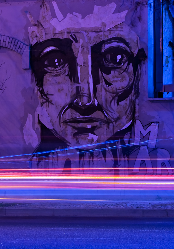
Original can be seen here. I drive past this place every day on the way to work, and think she's quite striking. This was taken on the way back home on the last day before the submission deadline.
In ACR: Adjusted white balance and tint, cropped, straightened. In Photoshop: Levels, curves, Noise Ninja, sharpened, resized and saved for web.
[Feb. 2nd, 2010 05:40:27 AM]
This made it up to ~6.4 (at the time of writing) from a miserable start of 5.5 after 20 votes, so I'll be pretty happy wherever it finishes now.
Statistics
Place: 4 out of 128 Avg (all users): 6.4739 Avg (commenters): 7.9231 Avg (participants): 6.3269 Avg (non-participants): 6.5220 Views since voting: 3029 Views during voting: 384 Votes: 211 Comments: 22 Favorites: 3 (view)
Hi Sam,
Wanted to tell you that I saw this graffiti recently with my own eyes, and the very first thing I thought about was your picture.
Again, great job!
Cheers Sam,
a small world this is! :)
Before I say anything else, ti's a tripple honor to get your picture for critique because:
* it's of someone close
* it's one of my favorites
* it's an honorable mention
Having said that, I believe my mission is tree times as hard.
Artistic Merit Pros: * Beautiful subject. Striking is is the right word. The hard contrast in the lines of the graffiti makes it look the most life like and the strongest of the whole challenge.
* Excelent toning, even though - as I said in my comment - the general hue is not to my liking, after a while it grows on you and it's one of the factors that really makes this photo work.
Cons: * Cropping. This is the only thing I have going against this picture. I understand why you went for the Thirds with the lights but a tighter crop on the bottom just marginally below the side walk would have worked even better IMHO. It would have reinforced the triangles: nose tip/eyes and: nose tip/shoulder line, aligning them with the corners of the frame.
Technical Merit Pros: * Excelent exposure taking advantage of the passing traffic.
* Excelent job taking care of distortion. Checking the site I believe you had to be creative and environmental friendly at the same time, as there was a small tree half in the way. This looks like a head on shot even though I'm pretty sure it was taken at an angle. Correct me if I'm wrong.
Emotional Merit Pros: * This is by far the strongest graffiti in the whole challenge. I'm sure it helped the score too.
* This shift to cold blue/purple gives it an eerie and almost supernatural look which is reinforced by the title of the photo. It has a kind of Bilal look and take it from me, this is no small compliment.
* When I entered "Main Street" I did it because I thought I would have to look too deep to find an interesting graffiti in Lisbon. To realize that this picture was taken as far as a 2 minute drive from my former house (come to think of it, I've signed the contract for that house 70 meters away from this graffiti, amazing coincidence!), just makes me wonder if my eyes have been really open for the last 8 years.
Cons: * What Cons? The only cons is not knowing the photo details in the voting phase or I would have elevated my score to 8/9 for emotional/technical value this photo now has for me.
Result You might thank the original artist for the material, but you have played the bigger role that lead you to a honorable mention and grab the 4th place by a pubic hair. The toning and the excellent technical work definitely made it work and score.
Keep up the excellent work you have been doing, I'm sure I'll keep following and getting my kicks out of it in the process.
I think "Quite Striking" is quite an understatement :) Well, maybe she is quite striking, but what you have done with it takes it to the phenomenal level with the deep purple light and the zooming car trails. WOW! I think this one may have been my choice for Blue! Congratulations on creating such extraordinary art out of a quite striking scene :)





 Add photograph to your favorites
 Add photographer to your favorites

 Photographer found comment helpful.


