| Author | Thread |
Comments Made During the Challenge  |
|
|
06/27/2004 09:00:28 AM |
|
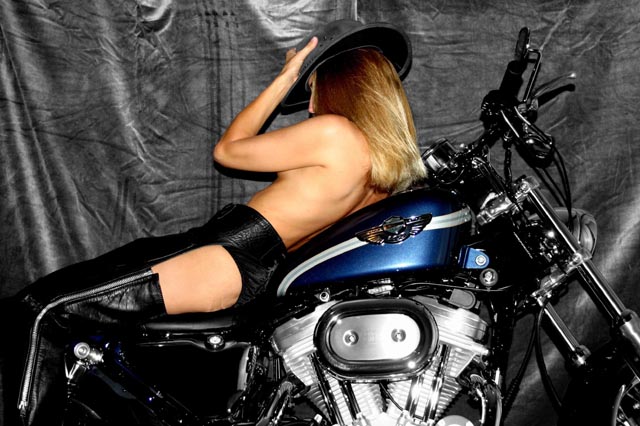
This photo doesn't seem much desaturated in anyplace. Nothing seems to be gained by the color versus grays. More of the motorcycle shown might make it more interesting. |
|
|
|
06/26/2004 02:26:16 AM |
|
Sexy. But I don't think the blue was necessary. |
|
|
|
06/25/2004 04:51:40 PM |
|
Nice but there's a lot of detail lost in the dark/black areas. |
|
|
|
06/25/2004 02:51:24 AM |
|
On revisit - it's a well taken shot - just confusing with two main subjects. I would have chosen between the model and the motorcycle to desaturate. I think the whole thing in color with the model desat would have made a good composition or vice versa. The bike has too many greyscale colors to make a good desat object. Excellent workmanship isolating the color areas from the backgound. Great job. |
|
 Photographer found comment helpful. Photographer found comment helpful. |
|
|
06/23/2004 09:06:02 PM |
|
I'd have desaturated the bike too as this way it draws attention away from the model. |
|
| Photographer found comment helpful. |
|
|
06/22/2004 08:13:05 PM |
|
I find the background incredibly distracting. |
|
|
|
06/22/2004 01:13:55 PM |
The idea is good, but the background and lighting hurt the shot. The background is messy and the light is so that it creates very hard shadows. Use a second light behind the MC to get some backlight for your model and a fill light for your background. To make the background look less messy:
a) Use another background, or
b) Increase the distance between the MC and the background and use a wide aperture (like F2.8 or less) to let the shallow dof blur it into oblivion.
The model's pose makes it look like we are looking from the wrong side. This feeling is also enhance by the way the steer stands pointing away from the viewer. |
|
| Photographer found comment helpful. |
|
|
06/22/2004 11:04:18 AM |
|
Very nice picture. The blue with the tone of her skin and the black motorcycle contrast well. Love it. |
|
| Photographer found comment helpful. |
|
|
06/22/2004 07:41:46 AM |
|
Good choice of uh... color |
|
| Photographer found comment helpful. |
|
|
06/22/2004 01:29:57 AM |
hmmmm.... I don't know.... Woulda prefered, hmm, red? ::grin:: And borrowed chaps just never fit quite right...
::grin::
Damn nice bike, though!
(obviously meant in jest, folks... Actually, I think the focus is great and the skin tones are perfect. Unfortunately, I also think there's too much color for the theme, and because both the bike and the model were left colored, they end up fighting for attention. But it really is a damn nice bike! Cute chick, too! lol) |
|
| Photographer found comment helpful. |
|
|
06/21/2004 09:20:44 PM |
|
Lots of glare here that you could've tried to eliminate. Even the backdrop is distracting. |
|
| Photographer found comment helpful. |
|
|
06/21/2004 05:38:33 PM |
|
This has potential...but I do find the model's pose to be a bit forced and unnatural, like she is quite uncomfortable. It's also difficult to discern whether or not this is a post desat or simply a "desaturated" environment from the start. The background is too bright for my taste; a solid black without much detail would lend itself well to the subject. Softer lighting on the model's skin might also look better, or a pass through NeatImage. I'd also like to see the whole bike, or have it at a different angle. Of course, all of these are my opinions. :o) |
|
| Photographer found comment helpful. |
|
|
06/21/2004 01:33:46 PM |
|
Nice sporty. Maybe a better background-something less distracting. The tank and air cleaner look a bit oof to me. |
|
| Photographer found comment helpful. |
|
|
06/21/2004 03:35:44 AM |
|
Excellent choice of where to desaturate, works very well indeed. Love this one. |
|
| Photographer found comment helpful. |
Home -
Challenges -
Community -
League -
Photos -
Cameras -
Lenses -
Learn -
Help -
Terms of Use -
Privacy -
Top ^
DPChallenge, and website content and design, Copyright © 2001-2026 Challenging Technologies, LLC.
All digital photo copyrights belong to the photographers and may not be used without permission.
Current Server Time: 06/29/2026 02:37:46 AM EDT.