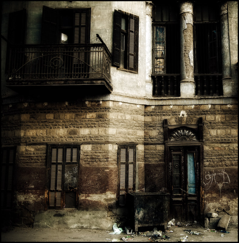
End of an era, sadly, as this beautiful building was all but rubble a week later. Interestingly, this shot was taken a year ago to the day. Amazing what a year can do. Then i was living in a very hot Egypt wandering the temples, tombs and desert taking photos. Now i'm wandering the streets and valleys of South Wales and Cardiff. Both as great as each other of course.
This is a slightly different edit to one i put up on DPC a few months back. It's a bit softer and the colour is richer. I know a few people will recognise it but it wasn't a challenge entry and i took it down early Dec when i thought i may use it for the Best Of.
Statistics
Place: 85 out of 445 Avg (all users): 6.2913 Avg (commenters): 7.2963 Avg (participants): 6.3046 Avg (non-participants): 6.2456 Views since voting: 1261 Views during voting: 419 Votes: 254 Comments: 34 Favorites: 2 (view)
I'm afraid to say Clive, that this is going to prove mighty challenging on my part to give you a helpful critique. I scored it a 9 and so it is hard to give you constructive criticism.
You may want to ask somebody else to give you a critique later on.
First thing that grabbed me was the lovely editing. I don't know what you did to it but it works well. The soft muted tones are very appealing to me. I imagine if it was shot in Egypt that the light maybe harsher than you have made it appear. The very gentle vignette really focuses your attention to the centre.
Your signature square crop also works well for this as the whole frame is filled with interest, there is no space wasted.
Not sure what you could have done to improve the score, it already got a pretty decent score in a Best of Challenge.
If you want somebody to give a better critique, suggest you post a request in the critique club thread and someone else may add some value.
Great job -- creamy without being soft-focus. That panel of light blue is gorgeous. I like that the chalky writings are illegible as runes from some far-off civilization. Lovely subject all around, aren't you glad you got it before it was destroyed completely?
Happy shooting, and sincere thanks for your supportive comments on my own entry.
Architecturally very interesting - wonderful tones. I didn't get to this one to comment during the challenge, but I love how it fills every inch of the frame with detail.
Just going though my 9s and commenting some..I really love the tones in this and the composition is very nice. The only thing tonal wise that bugs me is the bright square in the top left that keeps pulling my eye towards it.
What a disparity between street level and just one floor up... Such a very sad scene, as that was obviously a lovingly crafted building with rather good stonework.
If I'm honest, this image feels a little flat to me - I love the colours and textures but the overall lighting and edit robs the image of depth - perhaps that was intentional but I'm not sure it is working for me.
It's funny how it seems to start off in good condition on the top left and then decay more as you go to the bottom right. There's almost two worlds here, a look into the old world where this building was in it's prime and then the modern run down look, yet they both seem to co-exist at the same time as you look at it.
I remember this from before and once again I'm scoring it very high...I love it...I love the textures and your did the HDR (or whatever) very, very well







 Add photograph to your favorites
 Add photographer to your favorites

 Photographer found comment helpful.


