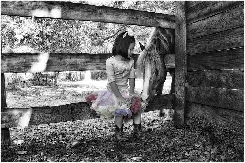
cloned out rake, dodge and burn, tonal contrast,lightened using layers, levels, turned black and white, brought back color of skirt, border, sized image, sharpened, saved for web.
Statistics
Place: 91 out of 445 Avg (all users): 6.2510 Avg (commenters): 7.2903 Avg (participants): 6.2308 Avg (non-participants): 6.3214 Views since voting: 1329 Views during voting: 412 Votes: 251 Comments: 36 Favorites: 3 (view)
This is one of my fav's in this Best Of 09 challenge. Nicely processed for the mood and effect. The subject and composition are all good.
Fine picture, Fl girl!
So sweet, and just that touch of pink on her frilly ruffles. Little girls think up the most interesting combinations of clothing sometimes. Reminds me of one of my daughters when she was young.
Lots to like in this photograph; selective desaturation and the like can be cheesy but I think you handled it subtly and it adds to rather than detracts from the photo.
tender and well managed, but I believe that it is biased towards the right, sin, I would have given a higher rating if the composition was more balanced. 7
I love the tender moment you caught here between this little girl and the horse! The B&W tones have strong dynamic range - there are no flat contrasts at all which typically can happen with color to b&w conversion without adjustments. I do find it a little odd that you left some soft pastel colors in the girl's tutu which makes it stand out. I guess you wanted to call our attention immediately to the girl. I don't think you needed that - a better way to have our eyes immediately fall upon your TWO (there is the friendship that is the hallmark of this shot) main subjects would be to crop to the vertical. That way the little girl and the horse dominates the scene and not only that you bring me (the viewer) closer into the observed scene. I am sometimes for negative space when it helps to compliment the scene or make it less busy, but the left 1/3 of the photo does nothing for the picture. I want to get closer to the mood and emotion I see here - bring us closer to your subject.
I like the composition and the conversion/exposure is great. Not sure how I feel about the desat. It's subtle and tasteful -- but then I'm wondering if it's needed at all.
Sweet. I'm wishing I could see more of the girl and horse and perhaps less of the surroundings. But if seen really large, I'd probably like it (not your fault). I like how you saturated her skirt.






 Add photograph to your favorites
 Add photographer to your favorites

 Photographer found comment helpful.


