| Author | Thread |
|
|
06/28/2004 11:42:48 PM |
|
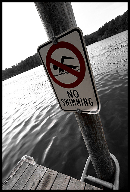
Wierd, 4.9 is too low for this one. The majority gave it a 5 but the "curve" leans towards the 1-4. I gave this a 7 because I like the wide lens, perspective, feel of the shot. What is strange is the high number of 1 to 3 votes which it DOESN'T deserve. Even if you think the red part isn't the best choice for the saturated subject, the rest of the pic makes up for it (I think). |
|
|
|
06/28/2004 11:40:17 AM |
|
Wow, what's with all the Canon D-SLR commenters for this pciture? Strange. Anyway.....a 4.9 for this picture? It's scored like these that make me wonder why I even continue to participate in DPC. |
|
Comments Made During the Challenge  |
|
|
06/26/2004 01:04:13 PM |
|
I really like the tilt here, its very effective. I'm sure you're getting comments on the red not being "in your face", but I like the fact that you didn't make it pop out because its still noticable. Other people might find this to be a boring photo, but I honestly think that taking simple objects and making them look appealing in a photo is a work of art, not everyone has that type of vision. Great job... |
|
|
|
06/25/2004 06:49:57 PM |
|
Not enough color in the red part of the sign to quickly tell this pic from a black and white picture. An unwise choice of picture to use for this challenge. |
|
|
|
06/24/2004 03:55:14 PM |
|
|
|
06/24/2004 04:24:42 AM |
|
Boring subject. Interesting angle and perspective, but that could be applied to any image. The angle or selective desat still doesn't improve this photo. |
|
|
|
06/22/2004 07:08:57 PM |
|
nice perspective. the red on the sign barely looks saturated, but I like the subtlety of it. very good |
|
|
|
06/22/2004 07:31:26 AM |
|
|
|
06/21/2004 03:33:24 PM |
|
lovely B&W conversion and interesting framing but I wish the red was redder. I suppose subtelty is wasted on me. |
|
Home -
Challenges -
Community -
League -
Photos -
Cameras -
Lenses -
Learn -
Help -
Terms of Use -
Privacy -
Top ^
DPChallenge, and website content and design, Copyright © 2001-2026 Challenging Technologies, LLC.
All digital photo copyrights belong to the photographers and may not be used without permission.
Current Server Time: 06/28/2026 02:20:13 AM EDT.