| Author | Thread |
|
|
12/21/2009 01:16:11 AM |
|
I have to say, I'm blown away that this picture came in low. It is so visually interesting! |
|
 Photographer found comment helpful. Photographer found comment helpful. |
Comments Made During the Challenge  |
|
|
12/19/2009 04:47:46 PM |
|
| Photographer found comment helpful. |
|
|
12/16/2009 07:58:07 AM |
|
An interesting slice of life shown well.....6 |
|
| Photographer found comment helpful. |
|
|
12/15/2009 11:09:43 PM |
|
Nice find, but even a shot of just the graffiti would have looked great as well =) |
|
| Photographer found comment helpful. |
|
|
12/14/2009 10:27:41 PM |
|
I like your vivid processing. |
|
| Photographer found comment helpful. |
|
|
12/14/2009 04:34:39 PM |
|
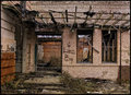
I see artwork in the background and minimal decay on the boxcar. Contrast seems a bit light on the car as well. No vote, I'm in this one. |
|
| Photographer found comment helpful. |
|
|
12/14/2009 12:35:49 PM |
|
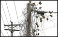
Crop it tighter to eliminate the wires and the house entirely, and I think it takes on a whole new life. |
|
| Photographer found comment helpful. |
|
|
12/14/2009 09:19:32 AM |
|
nice use of an alternate object in the setting. great clashing colors make each iece of the picture stand out as it's own article 8 |
|
| Photographer found comment helpful. |
|
|
12/14/2009 08:52:50 AM |
|
very good photograph here... perfectly on topic, i like colors and composition here... |
|
| Photographer found comment helpful. |
|
|
12/14/2009 12:24:34 AM |
I think this photo would be better with ether more saturation, or IMO better yet with less.
It is IMO in an awkward middle place without any clear direction of how you wanted it to look. |
|
| Photographer found comment helpful. |
Home -
Challenges -
Community -
League -
Photos -
Cameras -
Lenses -
Learn -
Help -
Terms of Use -
Privacy -
Top ^
DPChallenge, and website content and design, Copyright © 2001-2026 Challenging Technologies, LLC.
All digital photo copyrights belong to the photographers and may not be used without permission.
Current Server Time: 06/30/2026 09:40:25 AM EDT.