| Author | Thread |
Comments Made During the Challenge  |
|
|
06/20/2004 11:16:45 AM |
|
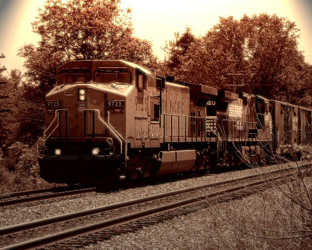
the sepia/duotone works beautifully here |
|
 Photographer found comment helpful. Photographer found comment helpful. |
|
|
06/20/2004 05:29:52 AM |
|
Nice shot. In this case I feel the sepia might actually be destracting from fhe image though. I like the framing... |
|
| Photographer found comment helpful. |
|
|
06/18/2004 06:43:04 PM |
|
I like the sepia tone a lot, but I'm not sure I would have burned the upper corners. I'm just not sure it adds anything, and it kind of pulls your focus. |
|
| Photographer found comment helpful. |
|
|
06/17/2004 06:08:24 PM |
|
Nice picture, though the lighting effect looks odd on the corners. |
|
| Photographer found comment helpful. |
|
|
06/16/2004 09:40:11 PM |
Nice tone & composition.
Shame about the vignetting on the upper corners. |
|
| Photographer found comment helpful. |
|
|
06/16/2004 01:04:47 PM |
|
I think this would look better in color - the old timey feel doesn't really suit the modern diesel engine, and color would show off the bright yellow and red UP paint scheme. |
|
| Photographer found comment helpful. |
|
|
06/16/2004 10:22:36 AM |
|
Beautiful treatment...very nostalgic feel. :o) |
|
| Photographer found comment helpful. |
|
|
06/15/2004 05:21:28 PM |
|
I like the feel this one gives. Great job |
|
| Photographer found comment helpful. |
|
|
06/15/2004 04:38:11 PM |
|
I really like this but it would have looked better if you had cleaned up the upper corners with clone, or cropping |
|
| Photographer found comment helpful. |
|
|
06/15/2004 04:05:12 PM |
|
The sepia and the borders don't really fit the subject. |
|
|
|
06/15/2004 01:56:16 AM |
|
| Photographer found comment helpful. |
|
|
06/14/2004 11:59:49 PM |
|
The gradation of the upper sides is a bit distracting otherwise -- a nice photo, |
|
| Photographer found comment helpful. |
|
|
06/14/2004 09:09:09 PM |
|
Very nice shot, but I might have cloned out the vignetting on the upper corners. They are very distracting. |
|
| Photographer found comment helpful. |
|
|
06/14/2004 01:32:00 AM |
|
| Photographer found comment helpful. |
|
|
06/14/2004 12:25:14 AM |
|
why the vignetting at the top corners? Very odd. Otherwise, a great shot! |
|
| Photographer found comment helpful. |
Home -
Challenges -
Community -
League -
Photos -
Cameras -
Lenses -
Learn -
Help -
Terms of Use -
Privacy -
Top ^
DPChallenge, and website content and design, Copyright © 2001-2026 Challenging Technologies, LLC.
All digital photo copyrights belong to the photographers and may not be used without permission.
Current Server Time: 06/28/2026 03:25:44 PM EDT.