| Author | Thread |
Comments Made During the Challenge  |
|
|
07/07/2004 05:28:50 PM |
|
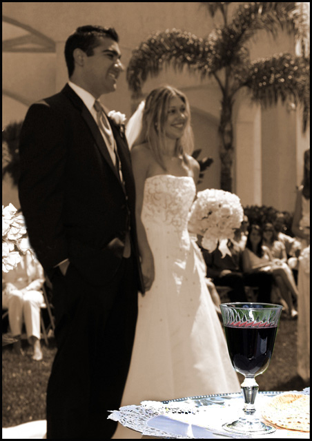
Since the cup of wine is the focus here, I think it might work well if it filled more of the frame. Still, I'm not certain if I'd rather see more of the cup or more of the couple (in focus). |
|
|
|
07/07/2004 03:27:07 AM |
|
Nice use of selective desaturation. Very nice relaxation of bridal couple and guests. It looks like a fun wedding. The lighting is somewhat unfortunate. An 8. |
|
|
|
07/01/2004 04:15:39 PM |
|
annoying use of selective desat. sorry. nice couple. |
|
|
|
07/01/2004 02:34:04 PM |
|
I'm not sure that making the bride and groom compete for attention with what appears to be (I know it really isn't) an oversized wine glass was really a good idea artistically--especially since the prominence of the glass draws attention to the blown out whites of the doilies. The bride and groom are charming, and I'd have liked the picture to focus on them. |
|
|
|
07/01/2004 12:53:59 PM |
|
Unfortunately the glass doesn't stand out enough to give it the effect I think you were looking for. At first glance it just looks like a plain old wedding photo. There doesn't seem to be enough of a contrast between the desat/sat areas. Seems like the glass would have been better placed neaer to the bride's boquet. Also the green and blue through the glass should probably also have been desat, as it kind of goofs with the natural flow of color. |
|
|
|
07/01/2004 11:43:12 AM |
|
This picture makes me wonder what the subject is, the happy couple or the wineglass. The wineglass draws all the attention because of color and focus, while I tend to consider the couple as the main subject. |
|
|
|
07/01/2004 07:27:22 AM |
|
I know what you were going for here, cup in focus and the bride and groom are the background. IMO I don't think that background is blurred enough to put focus on the cup. When I initially looked at this I thought what the heck they are out of focus! But then I saw the cup. |
|
|
|
07/01/2004 12:25:57 AM |
|
I don't understand the purpose of the selective color in this photo. This creates a dual subject and the minor of the two subjects tries to overpower the major with color. I'm not sure... If you were going for a 'cool effect' u have succeeded. Compositionally, the selective color doesn't work for me. |
|
Home -
Challenges -
Community -
League -
Photos -
Cameras -
Lenses -
Learn -
Help -
Terms of Use -
Privacy -
Top ^
DPChallenge, and website content and design, Copyright © 2001-2026 Challenging Technologies, LLC.
All digital photo copyrights belong to the photographers and may not be used without permission.
Current Server Time: 06/28/2026 11:25:14 PM EDT.