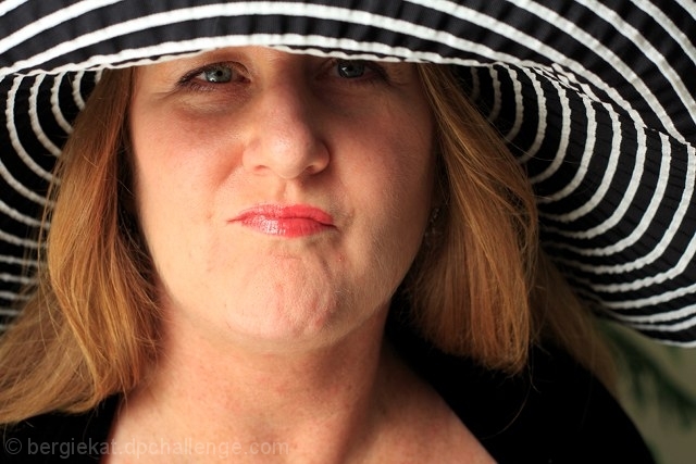
At least for me this is a hard shot to comment. I can see something poor on the woman's face, but wouldn't know what it is. Since you said, i agree it's the light. I probabbly didn't know what was it because i don't know anything about this subject (light and stuff). I read a few days ago some things about reflectors, just a white board or paper to reflect the natural light on her face, i'm sure you know that kind of thing because you have 94 years and 3 in dpc (:D) but maybe that would help. The worst part seems to be the left one, the light there doesn't help her skin, hair and makeup.
Talking about the composition, i think the little piece of background at the right is distracting. I would prefer to see background everywhere than just that little piece. But the best choice would be a different perspective showing only her face and the hat in my opinion. This perspective is giving more emphasis to the face than the hat.
The makeup is nice and i like her boring expression. And i think it meets the challenge well.
I hope i could be helpfull and you don't get offender by my giant newbie comment.
Cheers!
It is not easy to make portraits of people in hats. I don't know whether you used anything to lighten her face - something reflecting light to get rid of shadows under her eyes. Good idea, nevertheless :)
*not voting as I'm in this challenge-just commenting since I've seen requests for comments in the challenge thread*
Love the attitude in the expression, and the hat is super cool. Would help if you had a larger DOF so that the subject was in sharp focus throughout. Also if you had gotten some light up under her hat to light up her eyes a bit more. You can tell she has stunning eyes. some strategic light placement would make them incredible.
HTH





 Add photograph to your favorites
 Add photographer to your favorites

 Photographer found comment helpful.


